

Redesign for conversion & UI System
Car rental
A self-initiated UI redesign of a real car rental website — rebuilt from structure up: cleaner form logic, a modular component system, and a mobile experience that actually works.
TL;DR
Found a real car rental site through a Google Ad. It looked outdated, the booking form was overwhelming, and mobile barely worked. I redesigned it in two days — not by adding features, but by fixing structure: a proper component system, a scannable form, and layout logic that holds across breakpoints.

Why this site
I wasn't looking for a project. I clicked an ad, landed on the site, and immediately felt the friction. The layout was cluttered, buttons had no consistent states, and on mobile the form felt like a stress test rather than a booking flow.
For a service where trust is the deciding factor, that kind of friction is expensive. A user who isn't sure where to click doesn't book — they leave.
I decided to redesign it with one constraint: no new features, no content changes. Just fix what was already there.
The original site's problem
It wasn't one thing. It was a pattern.
Information hierarchy was unclear. Components weren't unified — buttons behaved differently in different contexts, interactive states were missing or inconsistent. The booking form was dense enough to make users second-guess whether they were filling it out correctly. The layout didn't adapt well to mobile.
The result: an interface that looked unfinished. And an interface that looks unfinished reads as untrustworthy.
For a car rental, trust is most of the decision. The visual system was quietly working against it.
Three users, one frustration
The site serves tourists looking for a simple mobile booking experience, business travelers who want speed, and locals comparing prices before committing. All three were let down by the same things: a form that was hard to scan, cards with inconsistent information, no clear visual hierarchy.
What united their needs was simple: transparent pricing, fast filtering, a direct path to booking without unnecessary steps.

Structure before styling
I started with wireframes, not visuals. The homepage used a Z-pattern to guide attention from the headline through the search form to vehicle cards. The booking form followed an F-pattern — how eyes naturally move through input-heavy layouts.
Getting hierarchy right first meant the visual system had something solid to sit on. Not the other way around.

Component system
I rebuilt the interface around a proper visual system:
12-column grid for desktop, 4-column for mobile
Spacing and radius tokens applied consistently
Accessible contrast and clear type scale
Modular components: buttons, chips, input groups, car cards — all with defined states
The goal wasn't just visual consistency. It was a system that could scale without breaking when someone adds a new vehicle category or a promotional banner.
The form
The booking form was the highest-friction element on the original site. I grouped related fields, aligned inputs properly, and kept the CTA visible at all times — on both desktop and mobile.
The toggle for "drop off at a different location" got explicit visual logic. On mobile, every interaction is thumb-reachable. Nothing relies on hover.

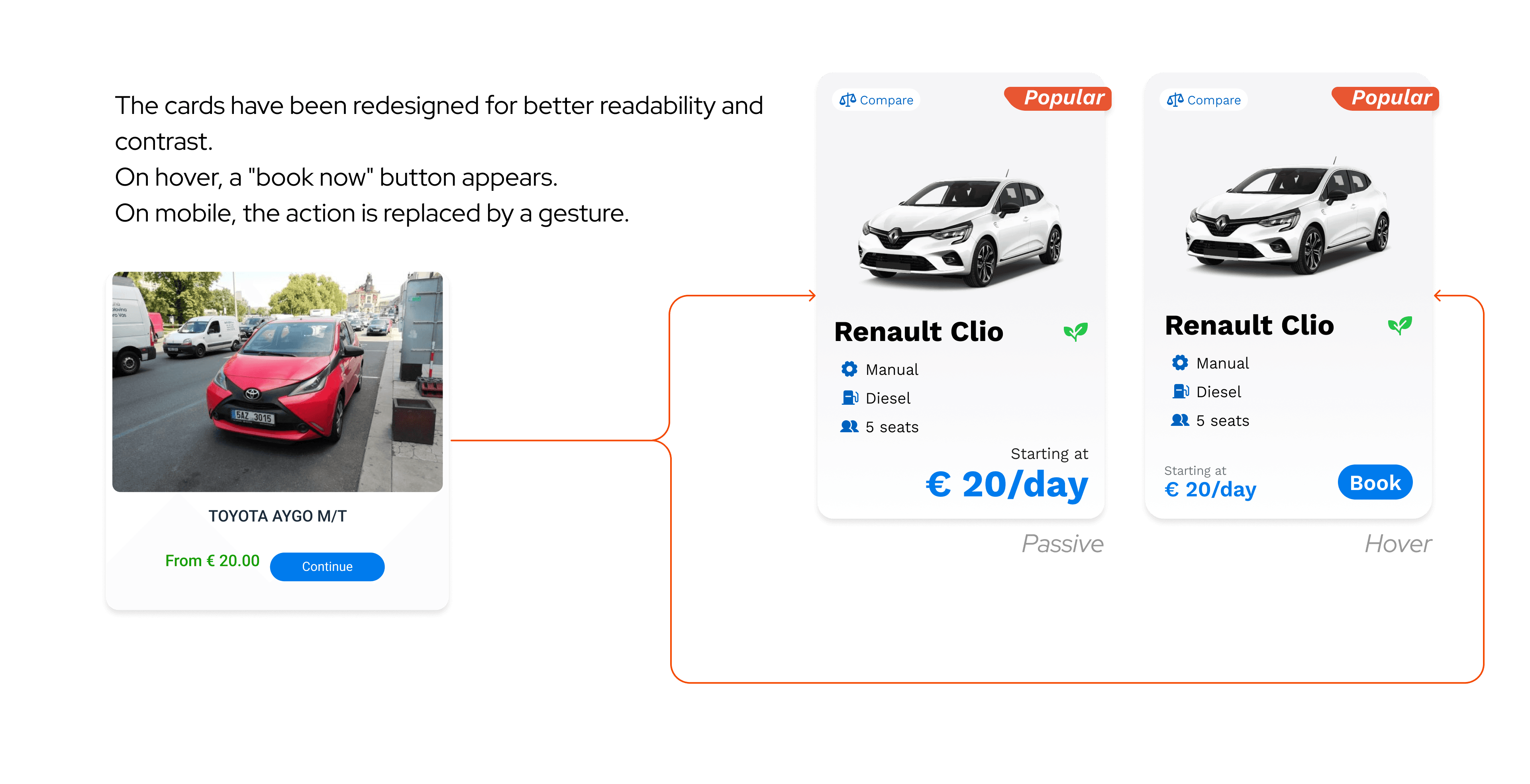
Car cards
Each card shows exactly what a user needs to decide: vehicle type, fuel, transmission, seat count, daily price. Nothing else. Popular vehicles are marked visually. On desktop, secondary actions appear on hover to keep the card clean. On mobile, they're always visible.
Same layout, same spacing, same information hierarchy across every category. When the pattern doesn't change, users stop having to think about where to look.
What I learned
This project confirmed something I keep relearning: structure shapes perception more than style does.
I didn't redesign the brand, add features, or change the copy. I cleaned the layout logic, made the form scannable, and built components that behave consistently — and the interface started to feel trustworthy.

What I'd do differently:
Two days is enough to make things more coherent. It's not enough to know whether that coherence actually helps anyone complete a booking faster. I'd want to test the form flow specifically — where people hesitate, whether the toggle logic is obvious, whether the card density is right or just feels right to me.
The car cards are also underbuilt for real-world complexity. I designed for clarity, which left no room for promos, availability signals, or loyalty markers. Those are real product needs that would stress-test the layout in ways solo work with no brief can't simulate.
For a self-initiated project with no data and no user feedback, it did what it needed to: made me think carefully about how much value lives in structure alone — and how fast that thinking hits its limit without real users to push against.