

From research to prototype
Planty
A self-initiated project exploring what it takes to build a calm, structured mobile interface from scratch — and what happens when you test it honestly.
Context
Planty started as the final project for the Google UX Certification Course — a mobile app and responsive website to help users diagnose and manage houseplant care. The brief was open enough to be dangerous: no client, no constraints beyond the course structure.
I chose plants not because it's an underserved market (it isn't) but because it's a domain where the gap between existing solutions and real user needs is visible. Most plant apps are either overloaded encyclopedias or reminder tools that forget the person using them. I wanted to try a different angle: an interface that feels as low-stress as the activity it supports.
The project ran through November–December 2024. The output was 12 screens, two full design iterations, and a usability study with 7 participants.
Research
Personas
I built two personas from the survey and secondary research — different enough to create productive tension in the design decisions.
Aspam, 25, account manager. A collector of rare tropical plants, meticulous about care, skeptical of unverified information. He has dyslexia and ADHD, which means dense text and unpredictable navigation are real barriers — not edge cases.
Olly, 42, bakery owner. A recent immigrant who finds grounding in plants. Limited by language barriers, visual impairment, and time. She doesn't want to learn an app — she wants to manage her plants and get on with her day.
Designing for both meant accessibility wasn't a checklist item. It shaped the core logic: clear hierarchy, minimal text, predictable paths.
User journeys
Aspam's journey: open the app → find a plant → diagnose a problem → verify the information → act. The emotional arc ran from anxious to critical to confused to (eventually) relieved. The drop-off risk sat at the "verify information" stage — he doesn't trust single sources.
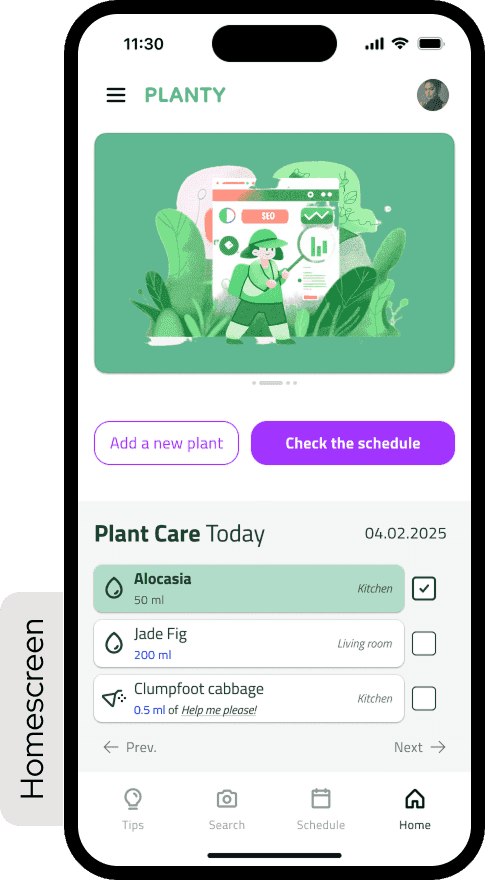
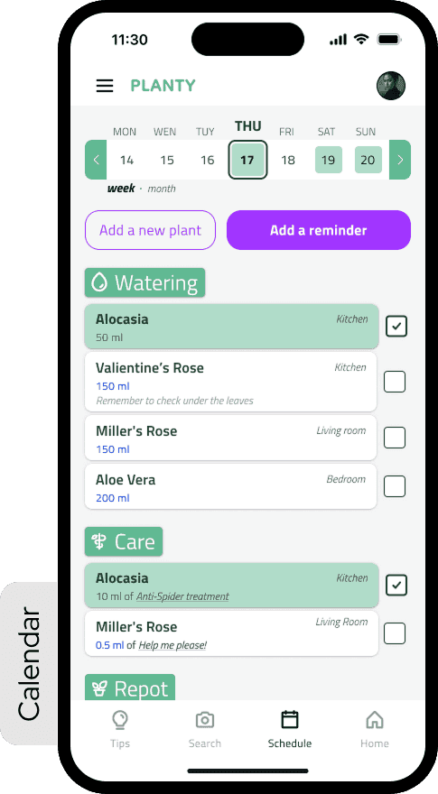
Olly's journey: create a plant → open the calendar → set reminders → receive them. Her frustration peaked at bulk management. Setting reminders one plant at a time was a deal-breaker.
What that defined
Two problem statements, two hypotheses, one goal.
For Aspam: if he can cross-reference care information from within the app, he'll be more confident acting on it. For Olly: if reminder management supports bulk editing and calendar sync, she'll feel in control rather than overwhelmed.
The value proposition that came out of this wasn't a feature list — it was a set of principles: accessibility-first, multilingual, transparent about information sources, low-friction for routine tasks, high-fidelity for users who want depth.
Competitors audit
Four direct competitors analyzed across features, accessibility, onboarding patterns, and information density. The consistent gap: none of them resolved the tension between being a knowledge base and being an everyday care tool. They tried to be both at once — and the result was interfaces that felt effortful to open.
Process
Visual direction
Before wireframes, I spent time with Microsoft Fluent 2 as a reference point. Not to copy it — the implementation specifics weren't the point. What I was studying was the atmosphere: layering, rounded forms, restrained color, the way depth communicates hierarchy without shouting. It was my first real attempt to think about UI as a system rather than a collection of individual decisions.
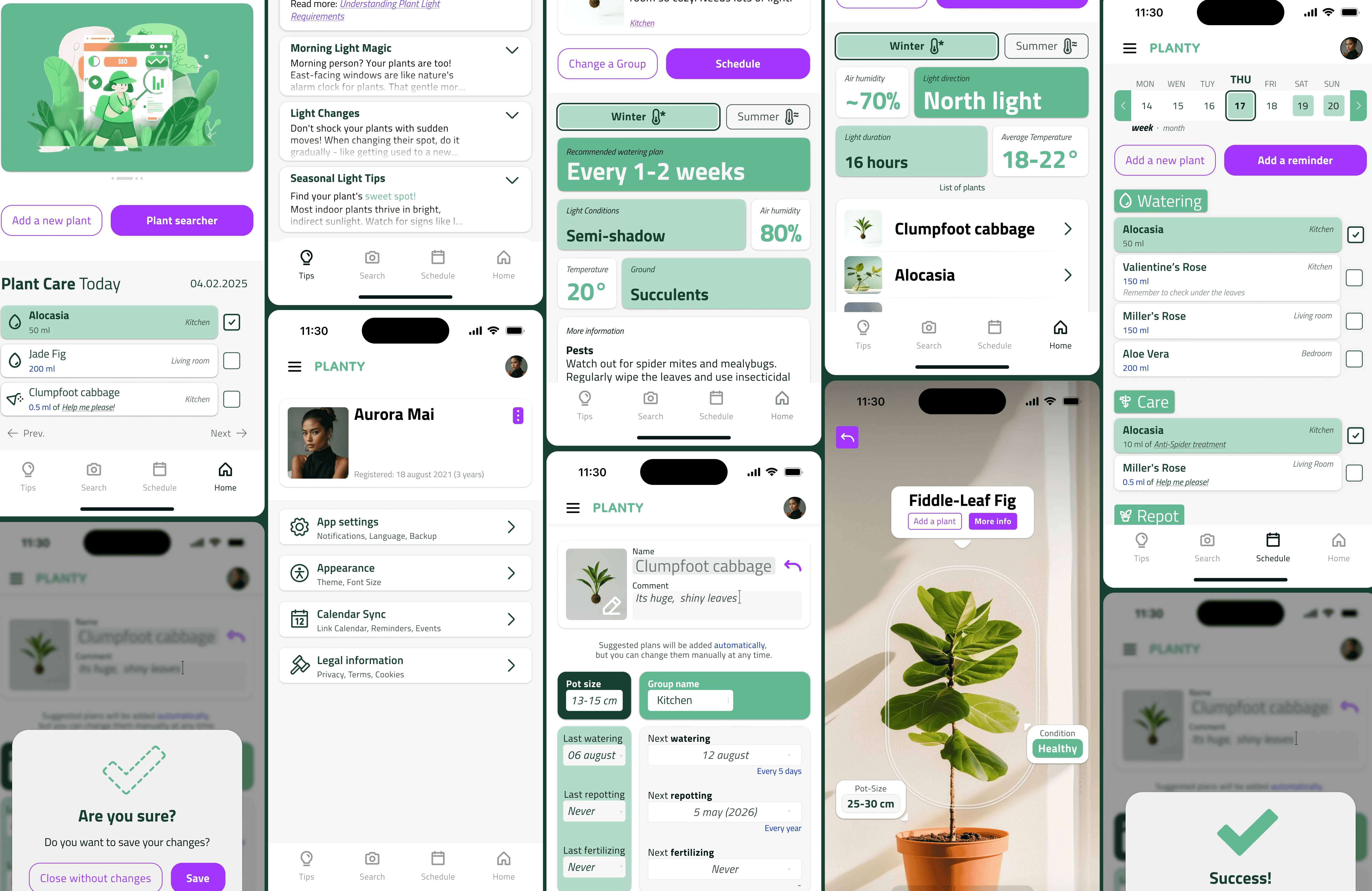
Storyboards and IA
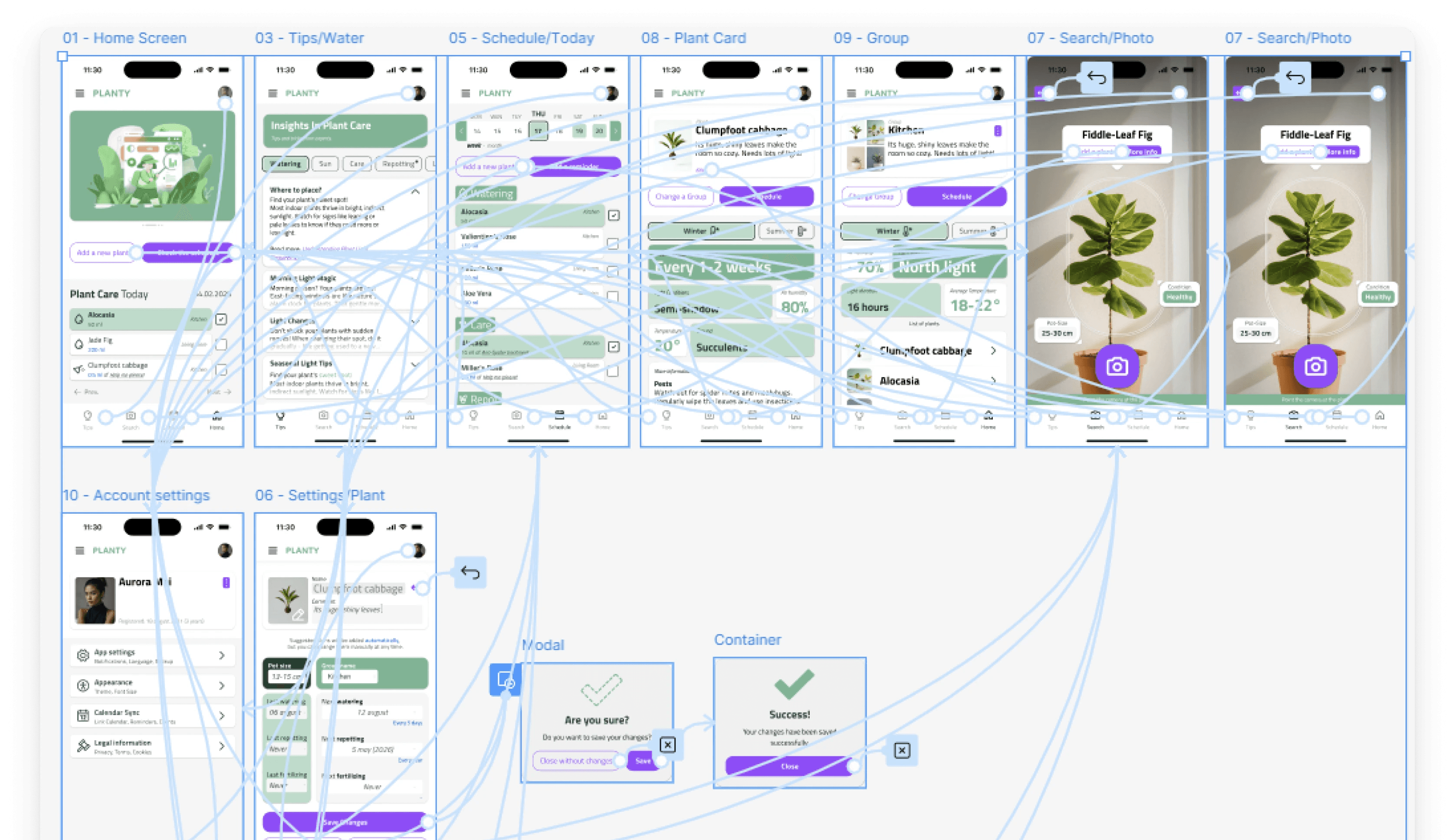
I storyboarded both personas' journeys before touching Figma. Then mapped the information architecture: three main sections (Tips, My Plants, Settings), each with their own decision trees. The reminder flow — Olly's core use case — was mapped in detail before a single wireframe was drawn.
First lo-fi — and why I threw it away
The first lo-fi prototype failed. Not a little — it was overloaded, structurally unclear, with interactions that made sense to me and no one else. After the first round of feedback, I made the decision to scrap it entirely rather than patch it. Starting over was uncomfortable. It was also the right call.
The problems weren't fixable with adjustments: too many elements competing for attention, no visual rhythm, the reminder flow buried three levels deep. It needed to be redesigned from a different starting point.
Second lo-fi — built from the user's perspective
The second version started from Olly's journey map rather than from the feature list. What does she need to see first? What's the minimum number of steps to set a reminder? What happens if she misses one?
It was cleaner and more structured. Still no components — just a clearer rhythm and better consistency between screens. The hierarchy that had been invisible in the first version became legible.
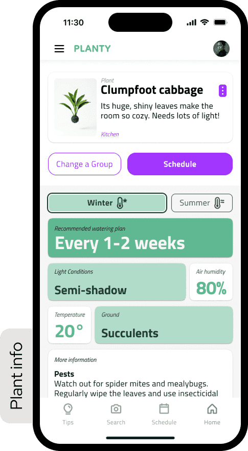
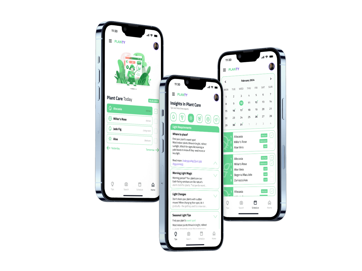
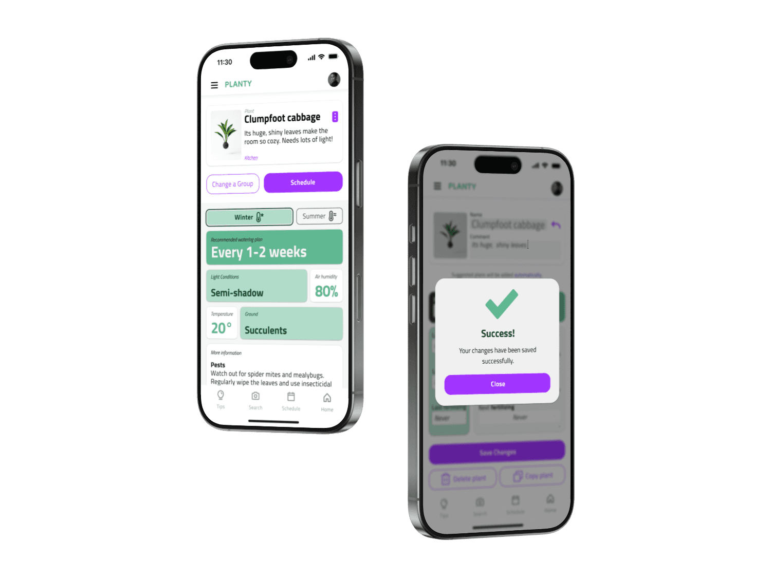
Hi-fi prototype
The final version introduced color, shadow, and a proper type scale. It looked like a real application for the first time. It also introduced new problems: the accent color was overused, and shadows occasionally competed with the hierarchy rather than supporting it.
Four things I took from this stage directly — without components, consistency is impossible at scale; color needs rules, not intuition; shadow doesn't equal hierarchy; fewer elements means more readability. These weren't conclusions I read in documentation. I learned them by making the mistakes first.
Usability Testing
I ran a moderated remote study through Useberry with 7 participants in December 2024.
71% completed the full study — 5 of 7. Two dropped off mid-session; likely prototype limitations rather than interface failure, but that's a guess, not a conclusion.
Task 1: Setting a new plant. 100% completion, average time 4 minutes 19 seconds. Longer than expected — the onboarding had more steps than users anticipated — but everyone got through.
Task 2: Adjusting a plant reminder. 50% completion. This was the result I hadn't planned for, and the most useful thing the study produced.
Three users couldn't locate the reminder editing flow. They navigated to the plant detail screen, looked around, and either guessed wrong or gave up. The entry point was nested under a secondary menu that seemed logical during design. It wasn't logical during use.
SUS Score: 61/100. Grade D, marginal acceptability.
The interface held structurally — users understood what the app was and how to move through it. But 61 means it wasn't intuitive enough to use confidently without prior familiarity. That gap — between something that works and something that's obvious — is exactly where the next iteration needed to go.
What the Data Said
71% of participants were aged 25–34. 57% had used a plant care app before. 86% used no assistive technology.
Users with prior app experience completed tasks faster and with more confidence. That gap pointed to a real problem in the onboarding: the interface assumed a familiarity it hadn't earned. Aspam's persona had been designed for exactly this user — but the implementation hadn't delivered on the research.
Iteration
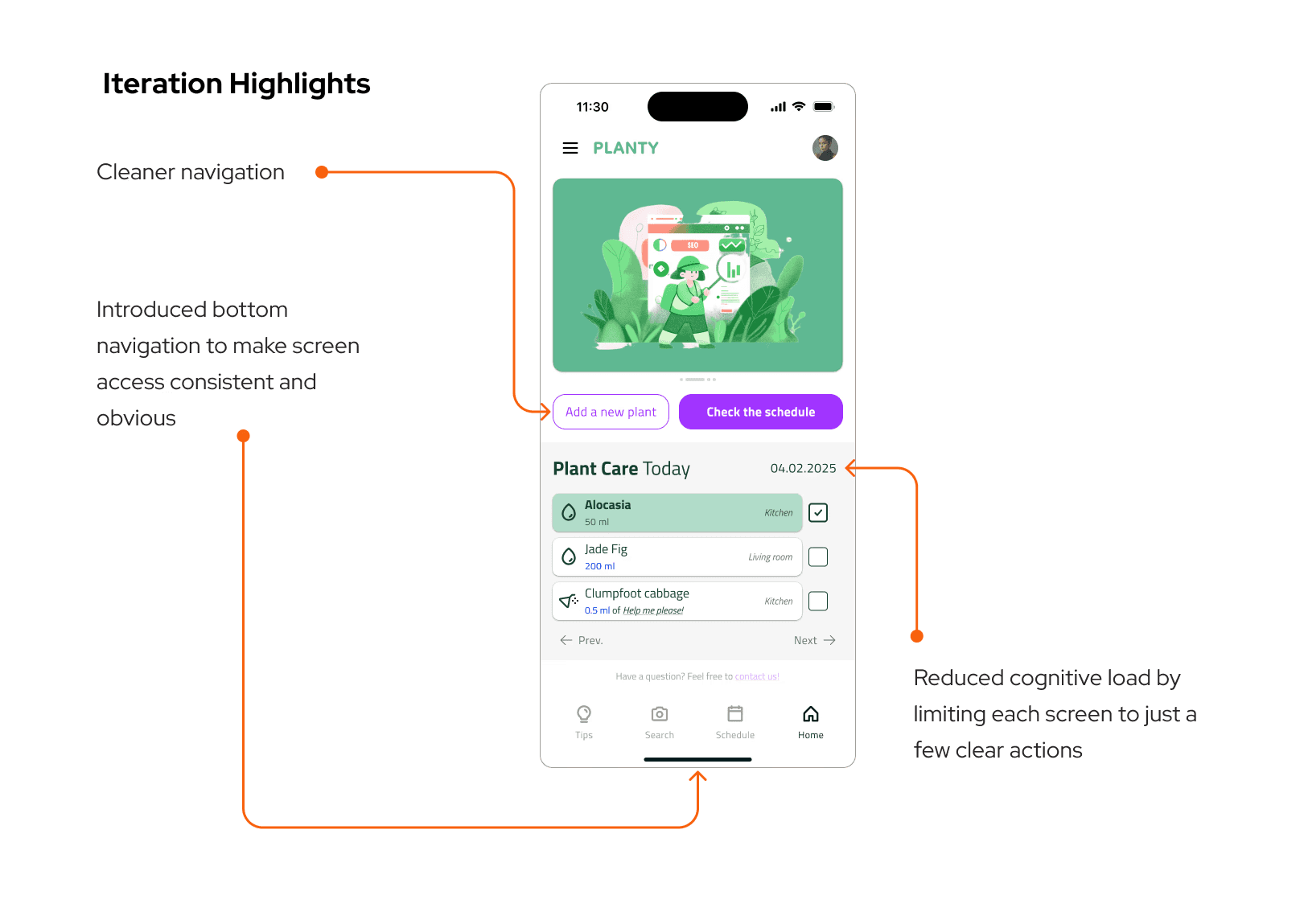
Three targeted changes after testing:
Reminder entry point. Moved from a secondary menu to a visible action directly on the plant detail screen. Maximum two taps from anywhere in the app.
Onboarding flow. Cut from six steps to four by merging care frequency and reminder setup into a single screen. Same information, half the friction.
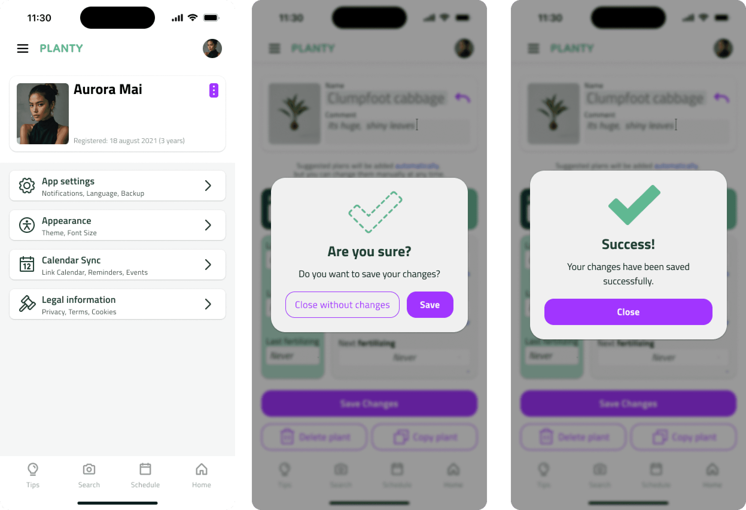
Edge states. Added explicit empty states, loading indicators, and error messages. Testing revealed how often these appear in real use — and how disorienting a blank screen is when you're not sure if something worked.
These changes weren't validated in a second test round. That's a scope limitation, not a design conclusion. They're grounded in what the study showed, but unconfirmed — which matters.
Reflection
Building a design system from scratch — even a small one — changed how I think about UI. The token set (spacing, type, color primitives) came first. Then components. Screens last. That sequencing slowed the early stages considerably. When iteration time came, it paid back every hour it had cost.
The SUS score of 61 was instructive. Designing alone removes the friction of having to explain decisions to someone else. Everything is coherent in your own mental model. A real user sits down, hesitates, goes somewhere unexpected — and that hesitation is information you cannot generate yourself.
The reminder flow failure was a specific, solvable problem. But it pointed to something larger: I had designed from the inside out. I knew where everything was, so I couldn't see what wasn't visible. Testing forced the outside-in perspective that should have been present earlier in the process.
If the project continued, the next step wouldn't be more screens. It would be another round of testing with the iterated prototype — to find out whether the changes actually moved the needle, or just moved the problem somewhere else.