

Brand & UI for a gifting platform
UniGift
Branding and UI for a personalized gift box service — identity, tone of voice, styleguide, and prototype built around one direction: warm, premium, nothing that oversells.
TL;DR
A commissioned branding and UI project for a personalized gift box service targeting women 25–40. Two weeks from brief to prototype: visual identity, styleguide, homepage and catalog — all complete before development was paused for business reasons.
The brief
The client had a clear concept: a platform for curated and custom gift boxes — not another flower delivery or generic e-shop, but something with emotional weight and taste.
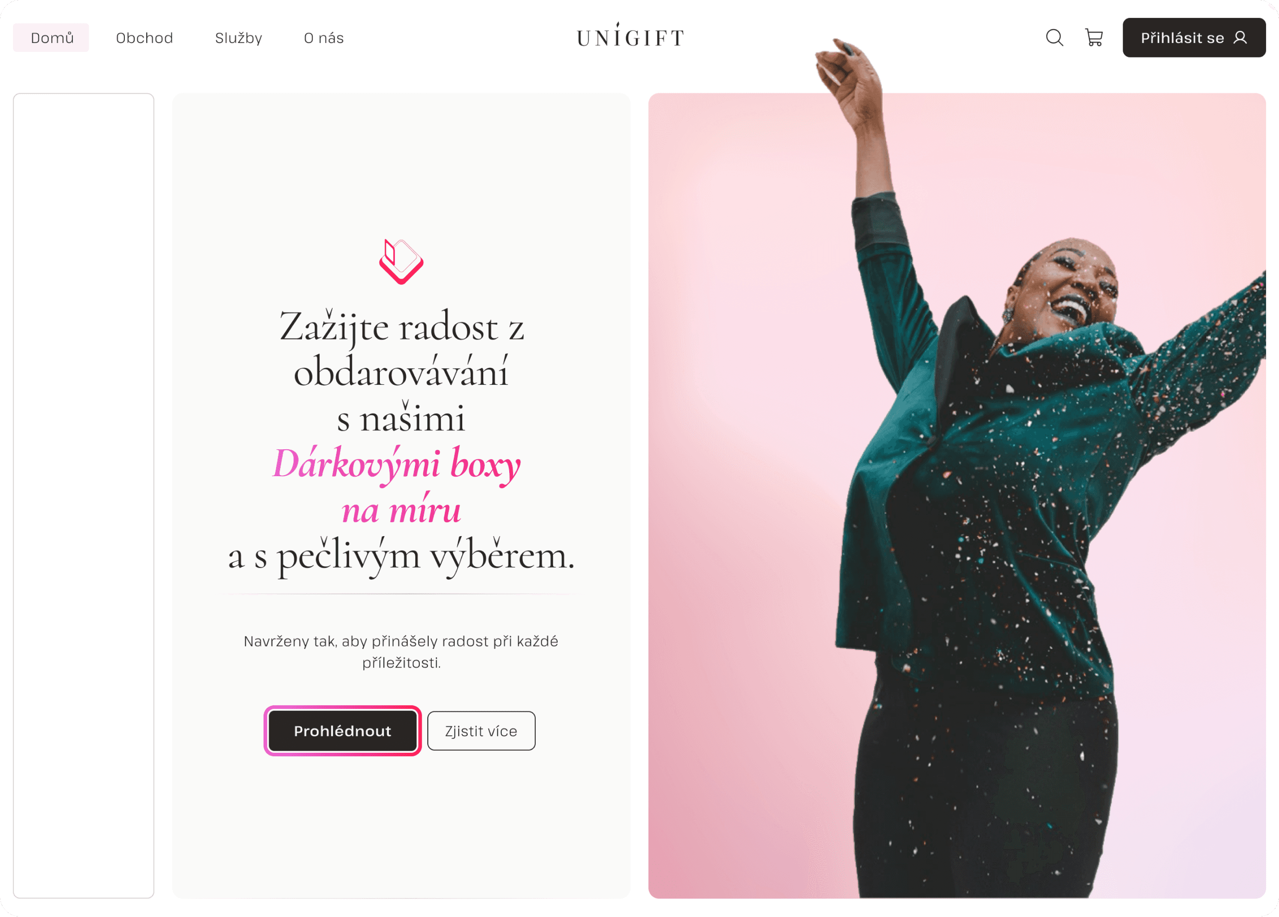
The target audience was equally clear: women 25–40, mid to high income, looking for something thoughtful and personal. The brief described it in one image: "an expensive hi-tech home with a marble kitchen, pastel flowers and balloons, gold ribbons, pink champagne — that's what the website should feel like."
My scope: name the visual direction, build the identity, and design the interface far enough that a developer could take it from there.

Emotional direction first
Before opening Figma, I needed to understand what "elegant gifting" should feel like for this specific audience — not premium in a cold, corporate sense, but warm, personal, and a little celebratory.
The moodboard answered it: natural light, delicate textures, marble, soft florals, gold accents. The tone of voice that followed was elegant and quietly self-assured — informal enough to feel personal, cultivated enough to feel trustworthy.
Not urgency. Not discounts. Celebration, care, taste.

Identity system
Every decision traced back to that emotional direction.
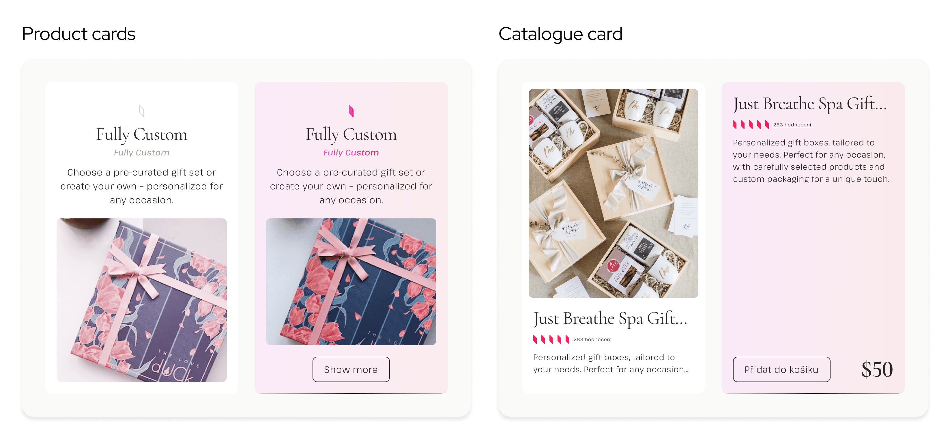
The logo combines a softly rounded symbol — representing the exchange between giver and receiver — with a classic wordmark. The typography reads as premium but stays legible. A secondary diamond element appears across the interface as a decorative and functional detail: section markers, rating indicators, UI accents.
The color palette is built on Tailwind Stone neutrals for backgrounds and structure, with Rose gradient accents for CTAs, highlights, and emotional moments. A warm gold supports photography and video toning. All colors were validated against WCAG 2.0 contrast standards.
Typography: Cormorant Italic for headings — warm, editorial, occasion-appropriate. Pathway Extreme ExtraLight for body text — airy, minimal, creates rhythm without competing.
UI system
The system had to carry the identity through behavior, not just appearance.
Grid: 12-column desktop layout, 960px content width. Breakpoints at 1440+ (desktop), 720–1024 (tablet), and under 720 (mobile) — with radius scaling from 20px to 16px to 8px across breakpoints. The UI softens as it shrinks, staying proportional on every device.
Buttons: gradient CTAs, outline states, muted disabled variants — all WCAG-consistent. Navigation links use slow, soft underline microinteractions that hold the tone without drawing attention.
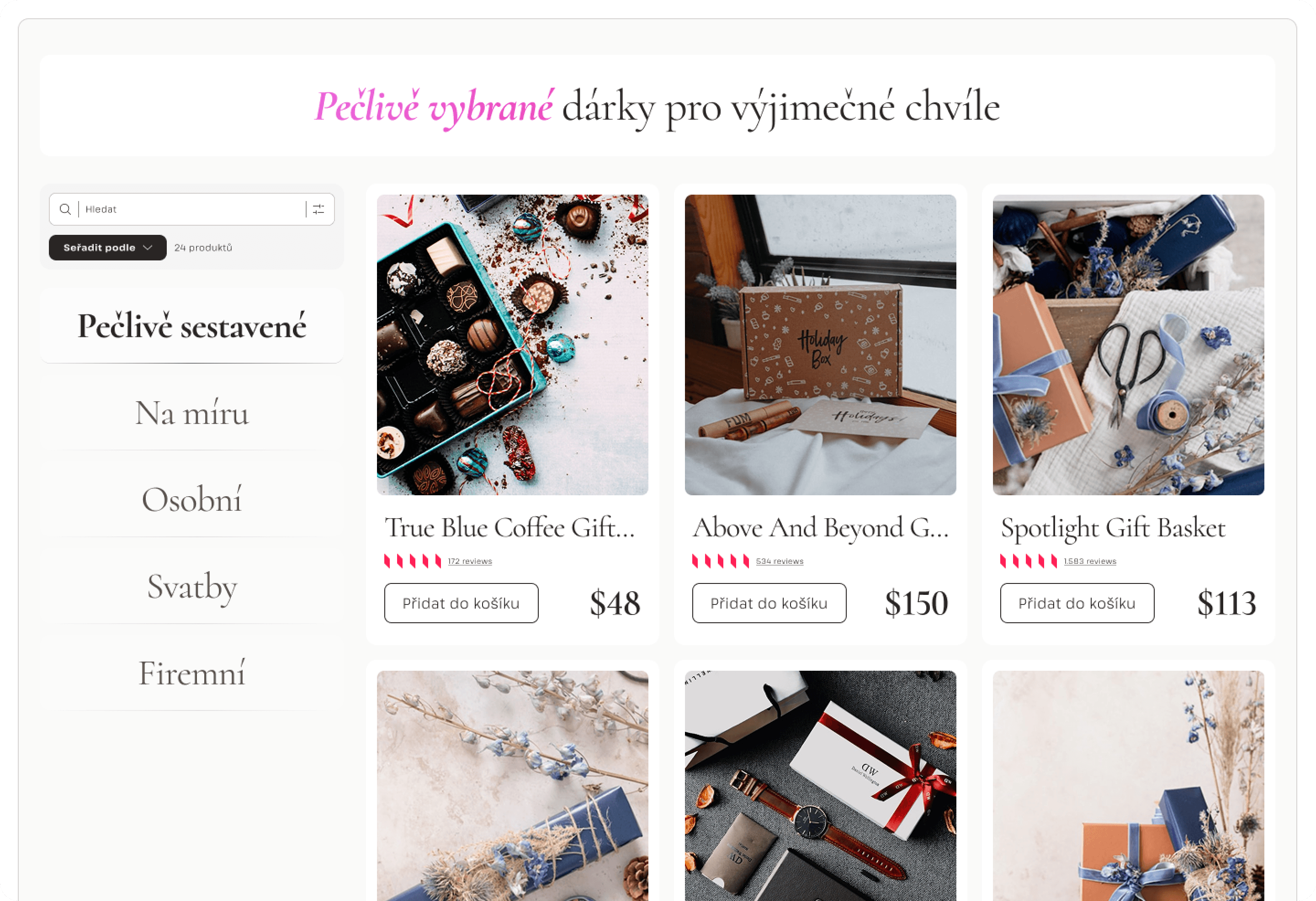
Cards: two types designed — product category cards for the homepage (image-led, title, short description, hover state) and catalog cards (photo, title, rating, truncated description, price, add-to-cart). Both use generous padding and content-led hierarchy. The catalog card also has a highlighted variant for featured items.
Filters: designed in terms of logic and placement, not implemented — their affordance is consistent with the system tone.
Screens
Only two screens were fully designed: the homepage and the product catalog. That was enough to stress-test the whole system — content structure, contrast behavior, responsive logic, microinteractions.
The builder flow and checkout were outlined structurally. The system was flexible enough to grow into them.
What worked — and what I'd expand
The tone stayed coherent across every layer: logo, layout, typography, motion. Components behaved predictably. Nothing oversold.
If the project had continued: I'd have built out the gift builder UX — step-by-step selection, pricing states, confirmation screens. That's where the real complexity lives for a service like this. I'd also test card hierarchy under real product data and refine filter affordance before final handoff.
"The interface doesn't demand attention — it supports the gesture of giving."