Unigift
Zakázkový projekt brandingu a UI pro personalizovanou dárkovou platformu. Zaměření na vizuální tón, jemné interakce a škálovatelnou strukturu – s funkčním prototypem a identitou připravenou ještě před pozastavením vývoje.

#hero —
#nav-trigger-1 —
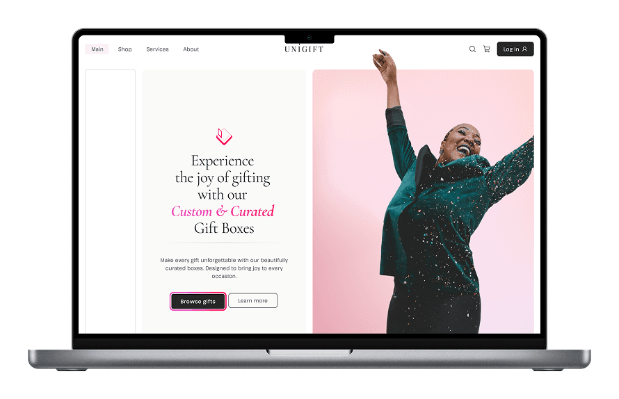
Unigift je koncept personalizovaného dárkového servisu zaměřeného na moderní ženy, které si cení stylu, péče a emoční hodnoty. Platforma umožňuje vytvářet nebo vybírat pečlivě sestavené dárkové boxy pro různé příležitosti — s důrazem na estetiku, náladu a prémiový zážitek.
Moje práce zahrnovala branding, vizuální identitu a návrh rozhraní pro úvodní stránku a katalog. Projekt byl po dokončení fáze značky pozastaven z obchodních důvodů, ale designový směr a systém byly dokončeny a připravené k implementaci.

#context —
Počáteční směr – klidný luxus s lidským tónem
Zadání

Cílová skupina byla jasná: ženy 25–40 let se středním až vyšším příjmem, hledající něco osobního, krásného a promyšleného.
Nešlo o slevy nebo urgentní nákupy – ale o péči, oslavu a vkus.
Představuji si drahý hi-tech dům s mramorovou kuchyní, květinami a balónky, stuhami ve zlatavé barvě a sklenkami růžového šampaňského.


#moodboard —
Od moodboardu k vizuální identitě
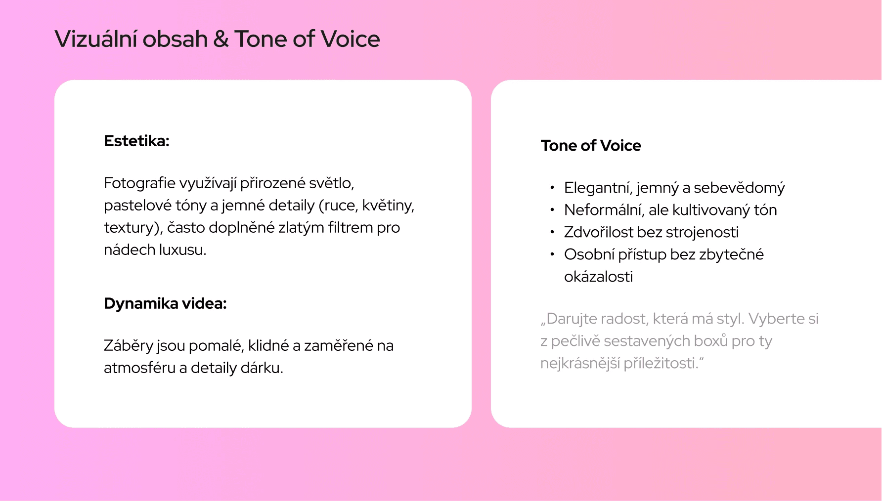
Začala jsem moodboardem, abych vystihla cílenou emoci:
přirozené světlo, jemné textury, květiny a klidná sebejistota.
Na základě toho jsem navrhla vizuální systém:
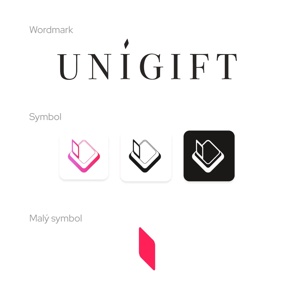
Minimalistické logo se symbolickým vyvážením – dar jako interakce
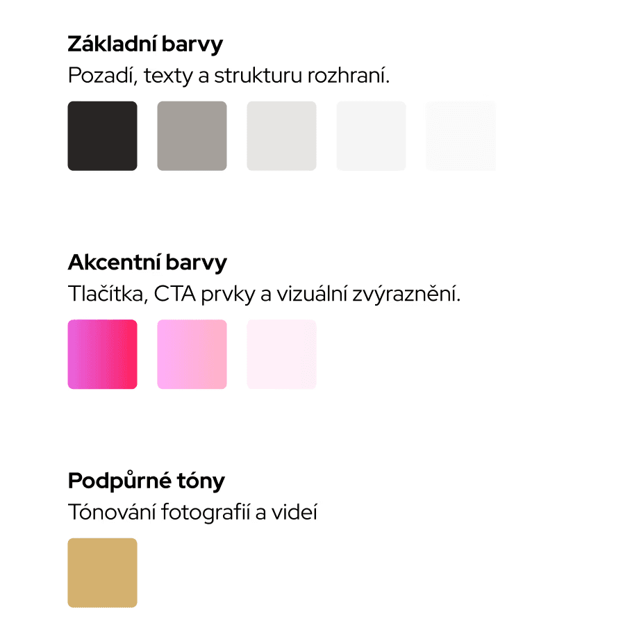
Barevná paleta založená na Tailwind Stone neutrálech s přechody v růžových tónech
Cormorant Italic pro vřelost, Pathway Extra-Light pro rytmus a kontrast
Tón komunikace: jemný, sebevědomý a nikdy přehnaný
Vše bylo záměrné – nic nepůsobilo dekorativně jen pro efekt.

#guidline —
#form —
Nejdůležitější nebylo, jak systém vypadá –
ale jak se chová.
Interakční design nesl identitu skrze pohyb, rozestupy a rytmus:
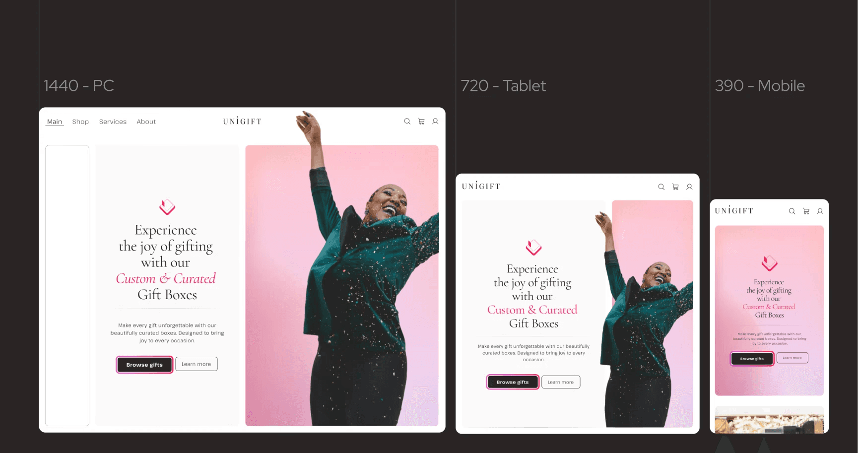
Mřížka: 12 sloupců se škálovanými zaobleními (20 / 16 / 8) pro přirozený pocit na každém zařízení
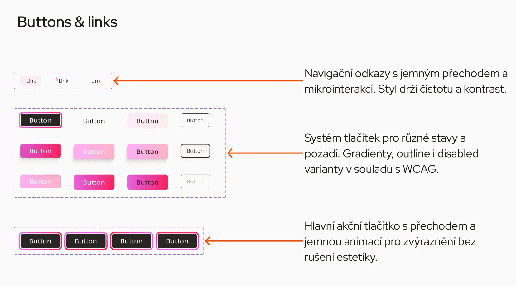
Tlačítka: gradientní CTA, obrysové stavy a utlumené neaktivní varianty – vše v souladu s WCAG
Navigace: jemné podtržení s pomalými přechody
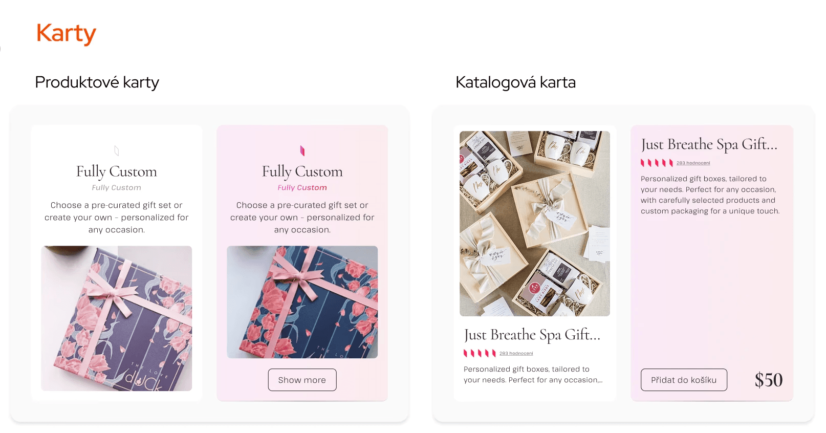
Karty: responzivní struktura, velkorysé mezery, hierarchie vedená obsahem
Filtry: navrženy, ale neimplementovány – jejich logika byla v souladu s tónem celého systému
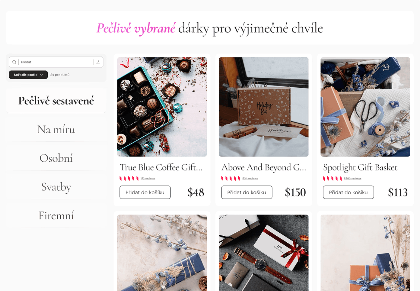
Byly navrženy pouze dvě obrazovky: domovská stránka a katalog produktů.
I přesto to stačilo k otestování celého systému: struktura obsahu, kontrast, responzivita, mikrointerakce.
Logika konfigurátoru a proces objednávky byly načrtnuty, ale nerealizovány. Přesto systém zůstal dostatečně flexibilní pro další rozvoj.
👉 Zde můžete vyzkoušet prototyp:


Co fungovalo – a co bych rozšířila
#context —
#reflections —