Sberbank
Vytvořeno během designové soutěže a postaveno na reálných dashboardech SberBusiness. Cílem bylo snížit zahlcení a udělat první kroky pro nové podnikatele méně stresující.


#hero —
#nav-trigger-1 —
Tento blok ukazuje směs rozhraní a fragmentů. Zaměřuje se na strukturu a interakce, ne na lokalizaci.
#attention —
Kontext
SberBusiness je rozsáhlý ekosystém – ale pro začínající podnikatele může působit nepochopitelně. Příliš mnoho nástrojů, termínů a záložek spadne na uživatele hned na začátku.
Otázka zněla: Jak navrhnout první zážitek pro někoho, kdo si teprve včera založil živnost?
Moje role
Do projektu jsem vstoupila v polovině – původně kvůli vizuálům. Nakonec jsem ale musela přestavět celé rozhraní:
Navrhla jsem onboarding od nuly
Zjednodušila dashboard
Vyčistila navigaci
A pomohla sladit logiku nástrojů s potřebami úplných začátečníků
Tým sdílel původní wireframy přes Miro, ale většinu jsem redesignovala. Výstupy vznikaly ve Figmě a odpovídaly testovacímu prostředí Sberu. Šlo o desktopovou maketu – stylově přizpůsobenou značce.
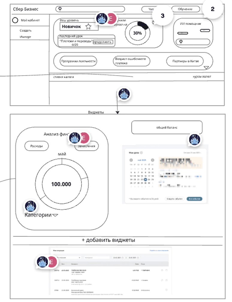
Původní wireframy od týmu.
Ukázka výchozího dashboardu.
#context —

Pokud tě první obrazovka vyděsí, není to onboarding. Je to sabotáž.
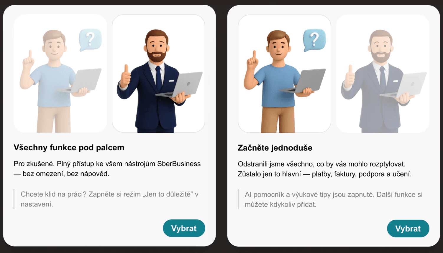
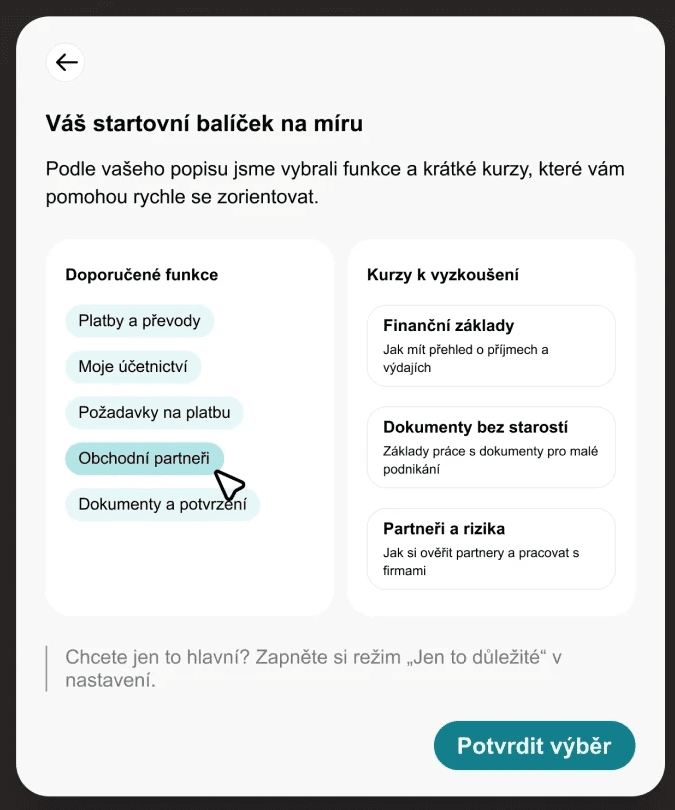
Phase 1: Choosing settings

Phase 2: AI help
Původní SberBusiness žádný onboarding nenabízel – uživatel byl vhozen rovnou do složitého systému.
Navrhla jsem modulární onboarding, který:
Umožňuje zvolit vedený nebo manuální režim
Sbírá základní info o podnikání
A doporučuje nástroje i lekce na míru
Tato část byla jediná plně lokalizovaná do češtiny. Zároveň tvoří základ pro zbytek redesignu.
Phase 3: Adjustements
#moodboard —
#guidline —
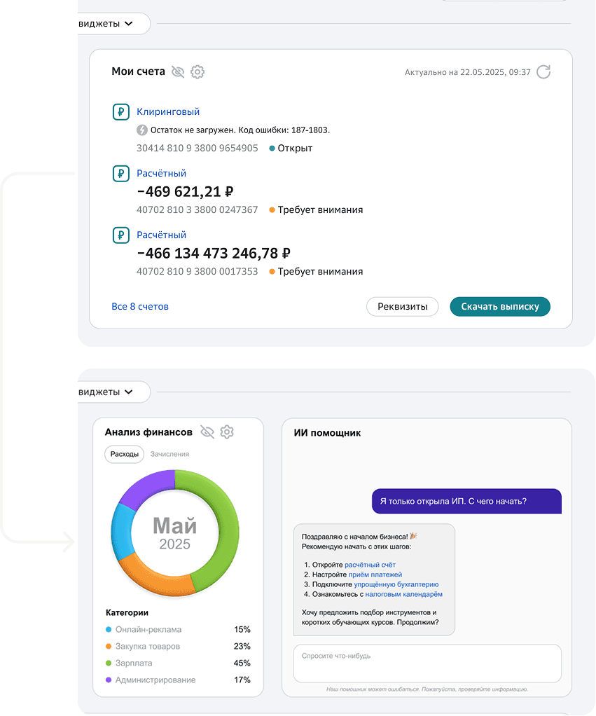
Redukce chaosu
Staré widgety jsem nahradila jasnějšími komponenty:
finanční přehled a AI asistent s kontextovými tipy.
Cíl: přinést přehled a hodnotu hned od prvního pohledu.

Lepší navigace
Zjednodušení menu odstraněním duplicit a nejasných položek. Pomohlo to uživatelům zaměřit se jen na to důležité – zvlášť v začátcích podnikání.
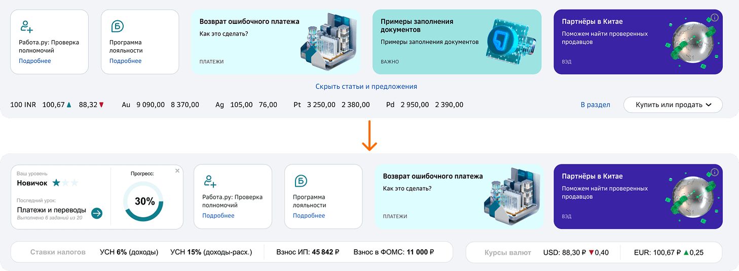
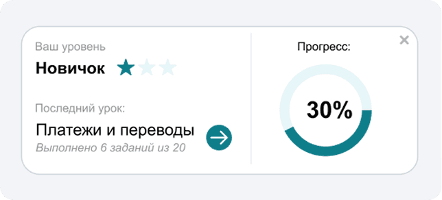
Sledování pokroku
Přidala jsem jednoduchý progress tracker. Uživatelé vidí svou úroveň a snadno se vrátí do rozdělaného kurzu.

Integrace výuky
Každá hlavní sekce nyní obsahuje malý výukový widget,
který doporučí mikrolekci podle toho, co uživatel právě dělá. Uživatel se tak může učit bez toho, aby opustil probíhající úkol.
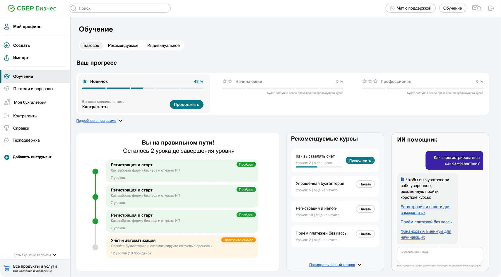
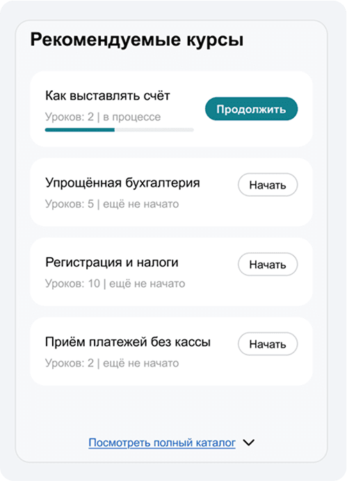
Doporučené kurzy
Krátké a praktické – doporučují se podle pokroku nebo typu podnikání. Každý kurz ukazuje celkový počet lekcí a jejich aktuální stav (např. „2 lekce rozpracované“, „5 lekcí nezačato“).
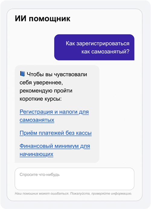
AI asistent
Konverzační widget, který uživatelům umožňuje klást otázky v reálném čase a dostávat návrhy na nástroje nebo kurzy podle kontextu. Například: „Jak si zaregistruju živnost jako OSVČ?“

Časová osa postupu
Zobrazuje průběh kurzu — jednotlivé moduly jsou označeny jako dokončené nebo aktivní. Ukazuje také počet lekcí a stav jejich splnění.

Tento modul byl navržen pro nové podnikatele jako rychlý způsob,
jak pochopit klíčové procesy — bez potřeby externí pomoci.
Nový formát lekcí
Každá lekce obsahuje krátké video, textové shrnutí, klíčové body
a rychlý test. Nechybí ani soubory ke stažení nebo poznámky.
Struktura
Lekce (obvykle 10–15 minut) vysvětlují témata krok za krokem. Zvýrazněné body pomáhají uživateli pochopit, co se naučí
(např. „Jak si ověřit obchodního partnera“). Materiály si lze uložit, vytisknout nebo otestovat v závěrečném kvízu.
Co jsem si odnesla
A co bych příště rozhodně udělala jinak.
Tento projekt začal úplně bez zadání – jen zprávou ve stylu „potřebujeme nějaké UI“. Nebyl žádný výzkum, rozsah ani produktový vlastník. Jen termín, pár chaotických wireframů a tým studentů ekonomie a práva, kteří se snažili navrhnout fintech rozhraní.
Mluvili jsme každý jinou řečí, ale s podobným cílem. Jejich „dashboard“ byla tabulka s ikonami a „AI asistent“ bez jakékoli logiky.
„Jen vizuály“ ve skutečnosti znamenalo: postav strukturu, oprav toky, a zajisti, aby to celé vůbec fungovalo.
Tak jsem začala – potichu a postupně. Přestavěla jsem onboarding, ujasnila layout, a kde to šlo, odstranila tření. Nebylo to elegantní, ale drželo to – jako systém sešitý těsně před nasazením.
Byly tam mezery a rozpory. Ale naučilo mě to něco zásadního: Někdy tvým úkolem není návrh dokončit – ale vůbec zjistit, co má být.
Když ten problém nikomu nepatří – patří teď tobě.
Nečekala jsem, že povedu celý proces – ale někdo musel určit, co vlastně znamená „hotovo“. Postupně se úkol změnil: z UI na UX, z UX na systémové myšlení. Z „ať to vypadá hezky“ na „ať to vůbec dává smysl“.
Co bych příště udělala jinak:
více se ptát, dříve definovat odpovědnosti a ochránit rozhraní před tím, aby chtělo být vším najednou.
#context —
#reflections —