

UX redesign for new entrepreneurs
Sberbank
A competition concept for Russia's largest fintech platform — onboarding flow, dashboard restructure, and an education module built from scratch in 14 hours.
TL;DR
A student competition concept for SberBusiness — Russia's largest fintech ecosystem. The brief was to reduce cognitive overload for new entrepreneurs. I joined mid-project, rebuilt most of what was there, and ended up designing the onboarding flow from scratch, restructuring the dashboard, and adding an educational module that didn't exist before.
The problem
SberBusiness is powerful — but for someone who registered their business yesterday, it's overwhelming. Dozens of tabs, financial terms, tools with no context. The question we started from: what does the interface need to be for someone who has never touched business banking before?
The original interface offered no onboarding. Users were dropped into a full dashboard on first login, with no guidance on where to start or what any of it meant.
My role — and what it became
I was brought in for UI. What I actually did was closer to UX: the team had rough wireframes in Miro, but most of them needed to be rethought, not just styled. I redesigned the onboarding flow from scratch, restructured the dashboard, simplified navigation, and built the education module as a new feature.
All visuals were created in Figma, aligned with Sber's test environment. Desktop-only prototype.
"Just visuals" turned out to mean: define the structure, fix the flows, make it all work.
Process
Step I — Onboarding
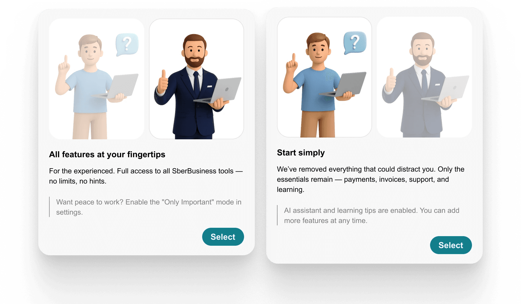
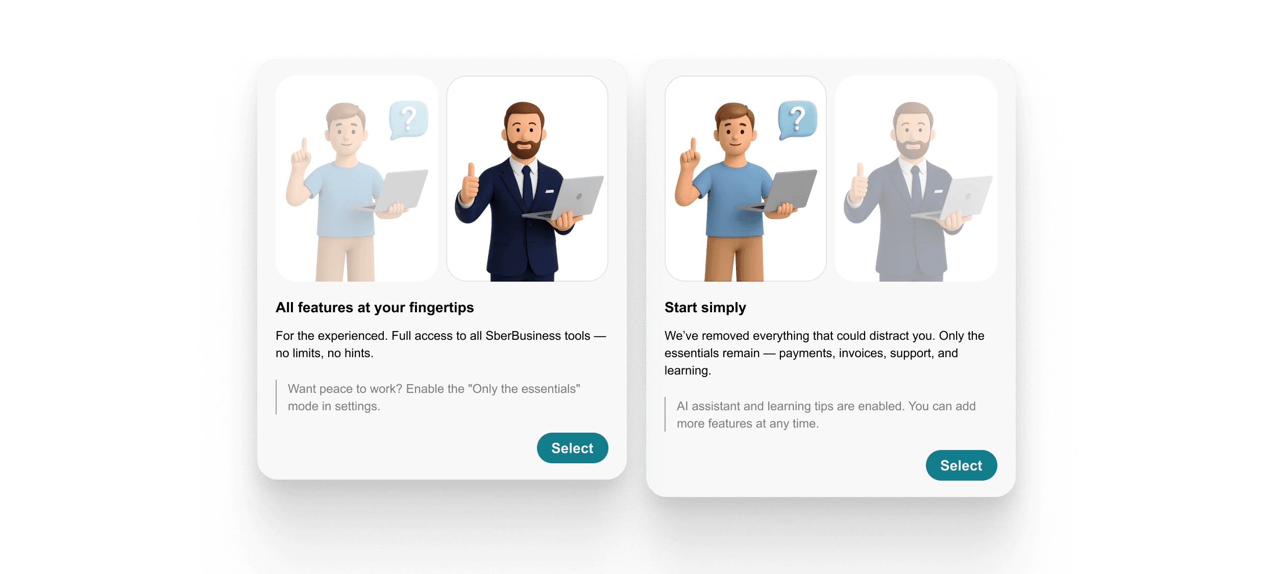
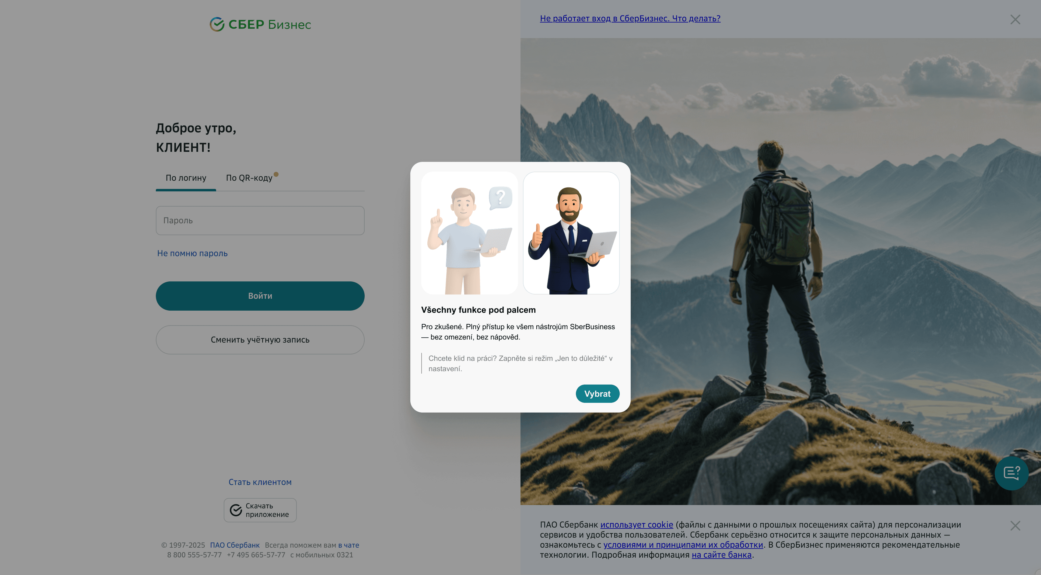
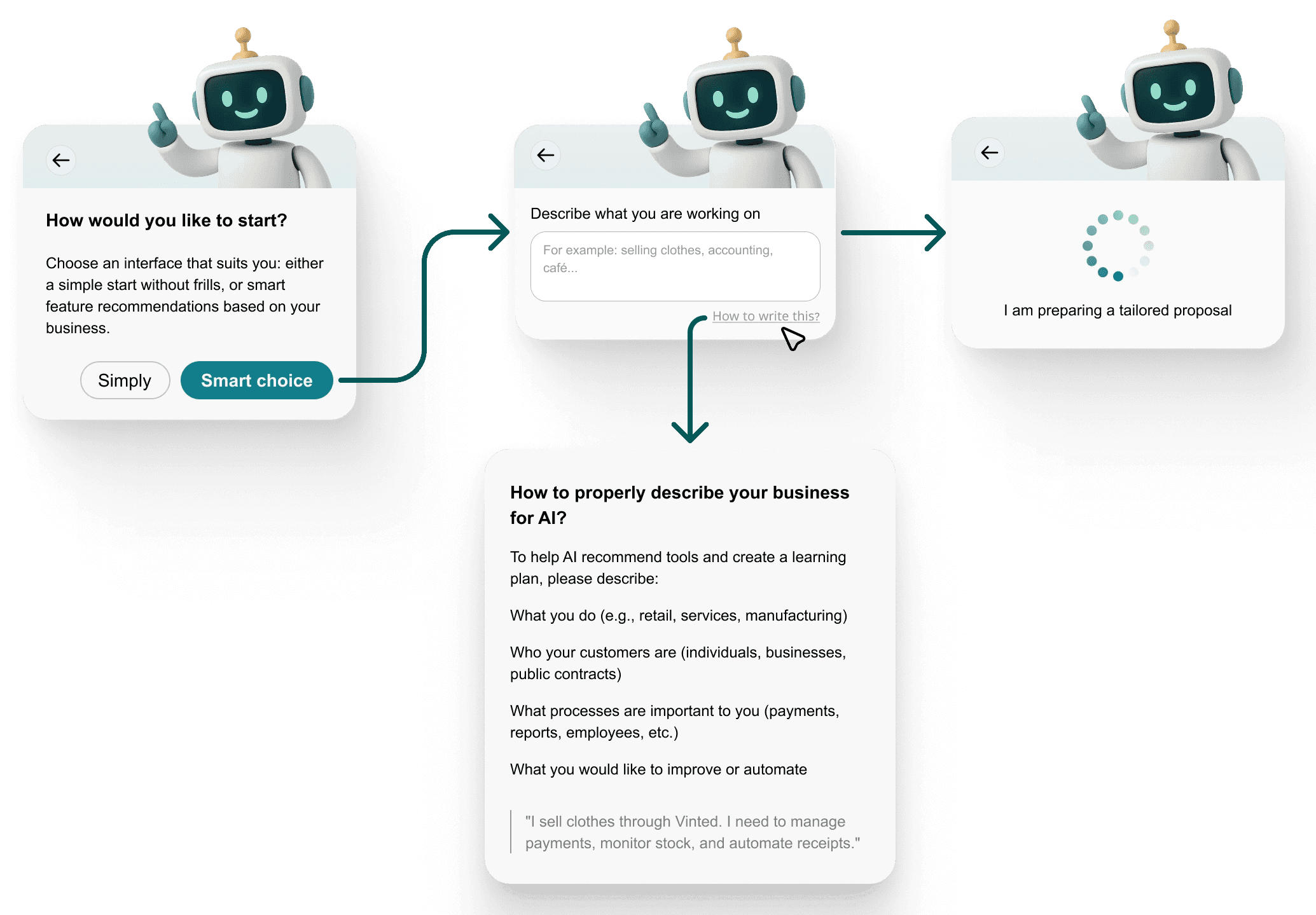
The original SberBusiness had none. I designed a modular flow: the user chooses between guided or manual setup, describes their business in plain language, and receives a personalised set of tools and learning suggestions.
Two paths: standard setup or AI-assisted. The AI path collects context about the business and surfaces only the relevant features — not everything the platform offers, just what makes sense for that user right now.
Step II — Dashboard rework
Three changes to the homepage:
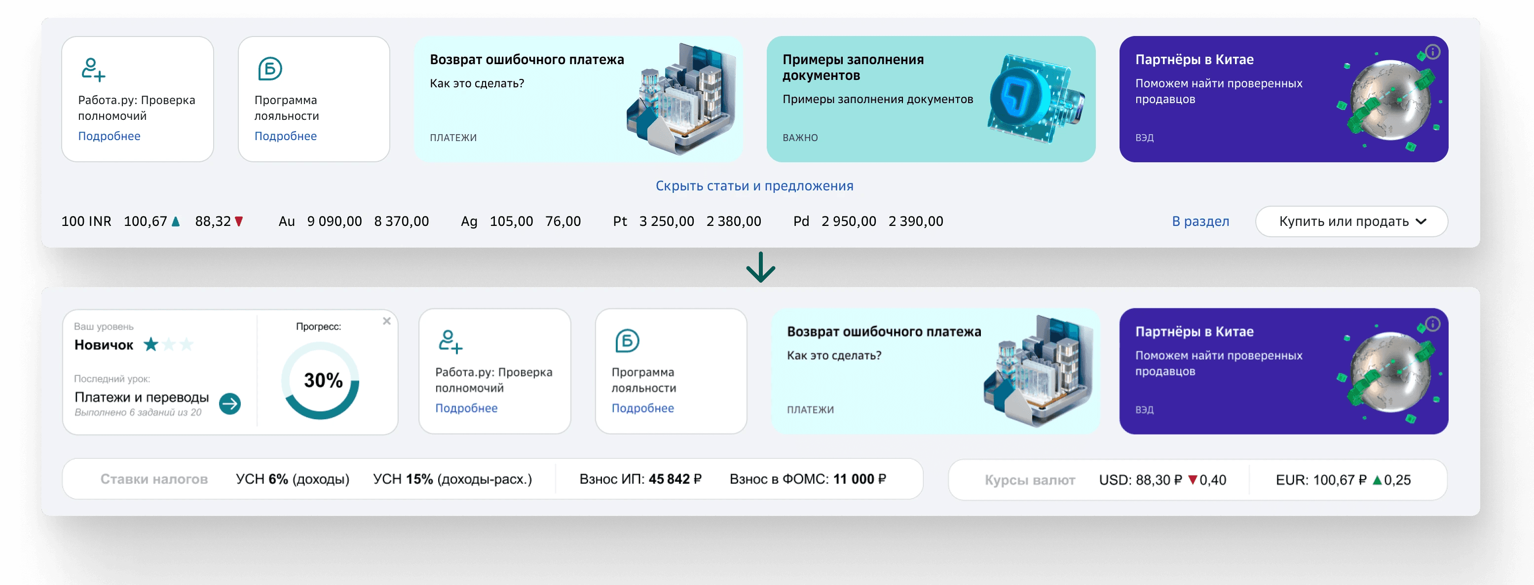
Navigation: simplified by removing duplicate and unclear menu items. New users don't need access to everything — they need access to the right things.
Widgets: replaced the generic accounts block with a financial overview and a contextual AI assistant. The goal was immediate value on first login — not a wall of numbers.
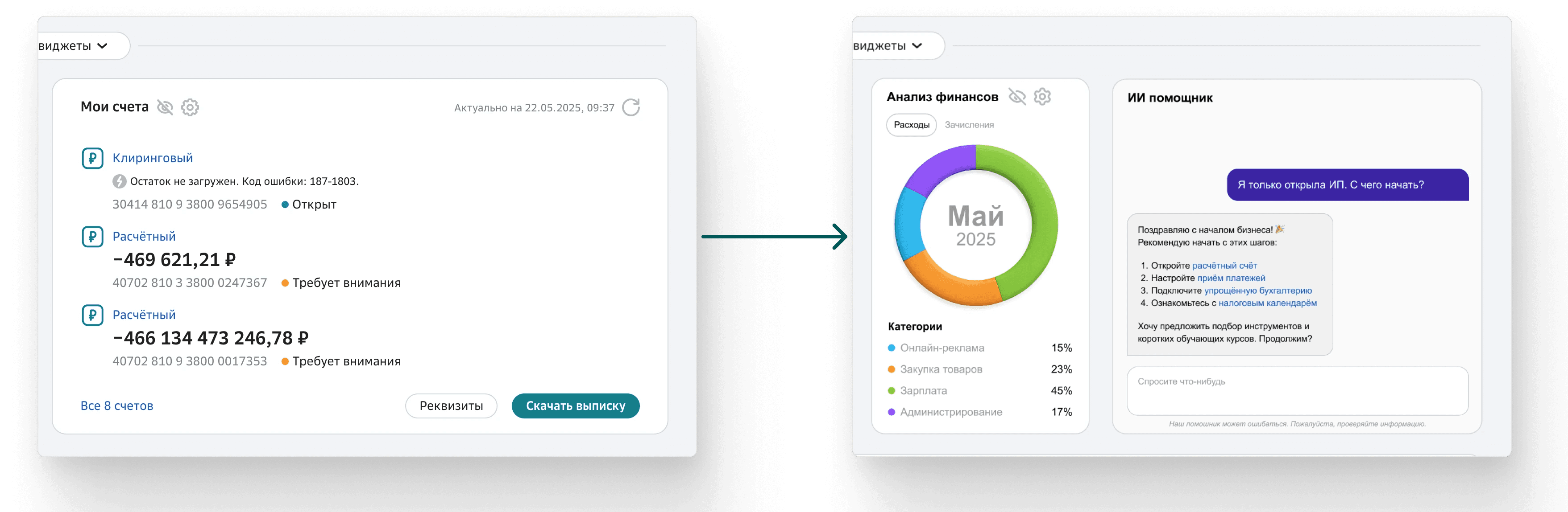
Progress tracker: a lightweight level indicator showing the user's current learning status and where they left off. Simple gamification — not points, just continuity.
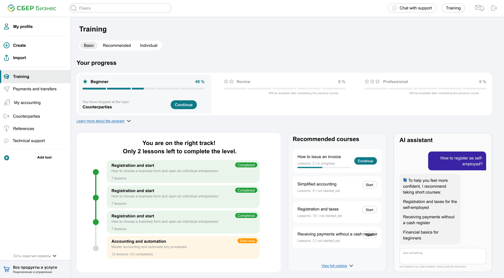
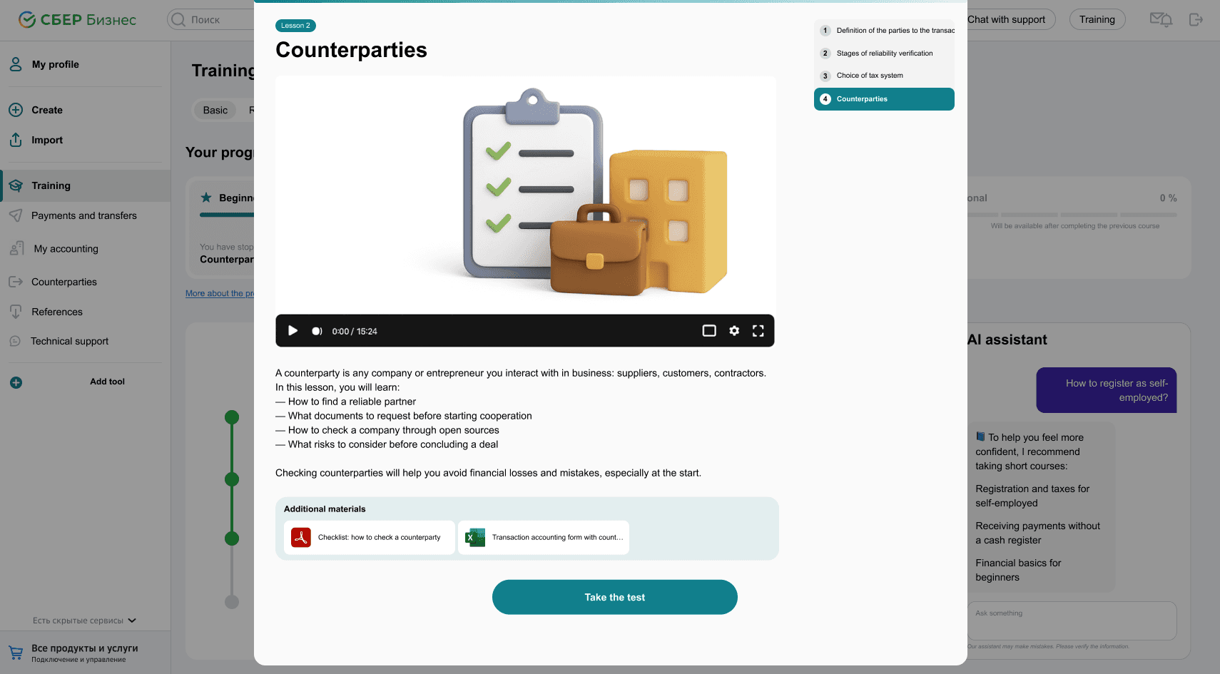
Step III — Education module (new)
Didn't exist before. Built as a standalone feature integrated into the main navigation.
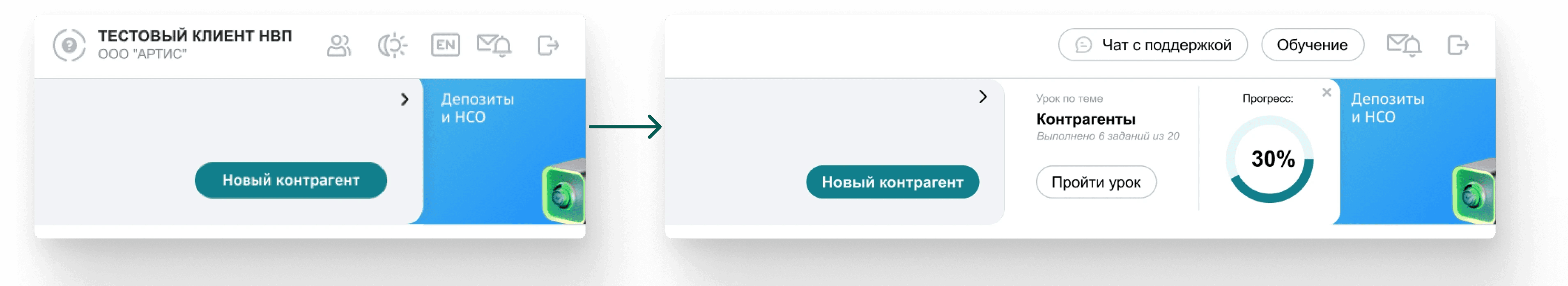
Three components: a progress timeline showing completed and active modules, recommended courses based on business type or current section, and an AI assistant that answers real-time questions ("How do I register as a sole trader?").
Each lesson includes a short video, a text summary, key takeaways, downloadable materials, and a quick test. Designed to replace the need for an external accountant or consultant for basic questions.
An educational widget was also embedded into each main category section — so users get a relevant course suggestion in context, not just in the learning tab.
What I learned
This project started without a brief — just "we need some UI" and a deadline. No research, no product owner, no clear scope. The wireframes were chaotic and the team spoke a different design dialect: their "dashboard" was a table with icons.
The real task wasn't to finish the design. It was to find it first — then make it hold together in 14 hours.
If I did this again: ask harder questions earlier, define ownership before things get fuzzy, and protect the interface from trying to solve everything at once.
If no one owns the problem — congratulations, it's yours now.