

A page migration that left the legacy behind
InvO
FakturaOnline’s front end is moving to React and a new design system, page by page. On the expenses list I used the move to drop legacy behaviour instead of copying it.
TL;DR
FakturaOnline is moving its front end from Vue to React, one page at a time, onto a new design system. The expenses list was one of the first pages to move. Nobody had complained about it, but I checked what people actually do there before copying anything, and dropped the legacy behaviour that didn’t survive that check.
What Clarity showed. On the expenses section, 24.5% of clicks were dead, twice the invoice list’s rate. The hot spot was the file upload on the expense form. On the invoice list, which uses the same table, around 42,600 clicks a month landed on rows that did nothing.
What I didn’t carry over
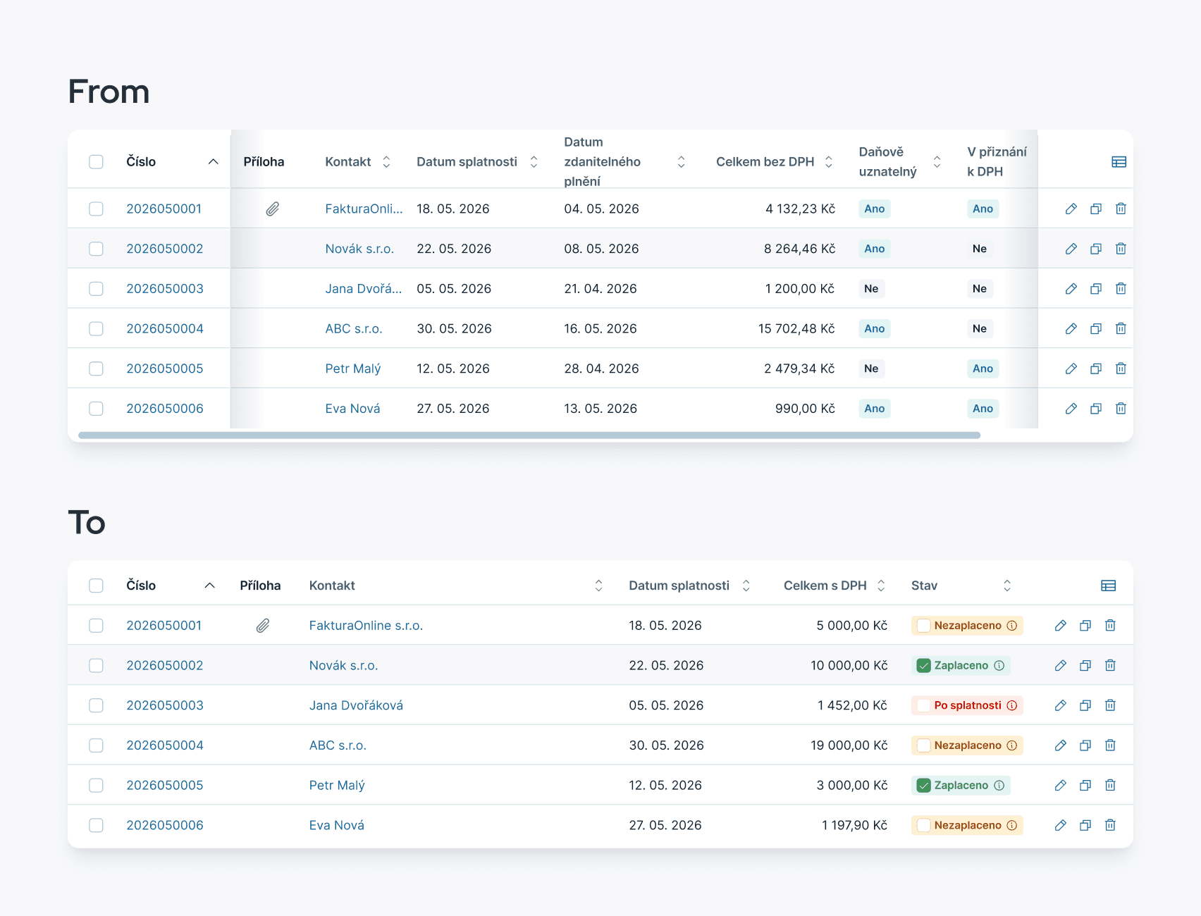
The row click is the Clarity finding above. The rest is legacy behaviour I didn’t copy.
Change | Before | After |
|---|---|---|
Row click | Only the number opens the expense | The whole row opens it |
Sort arrow | Could point the wrong way | Always matches the order |
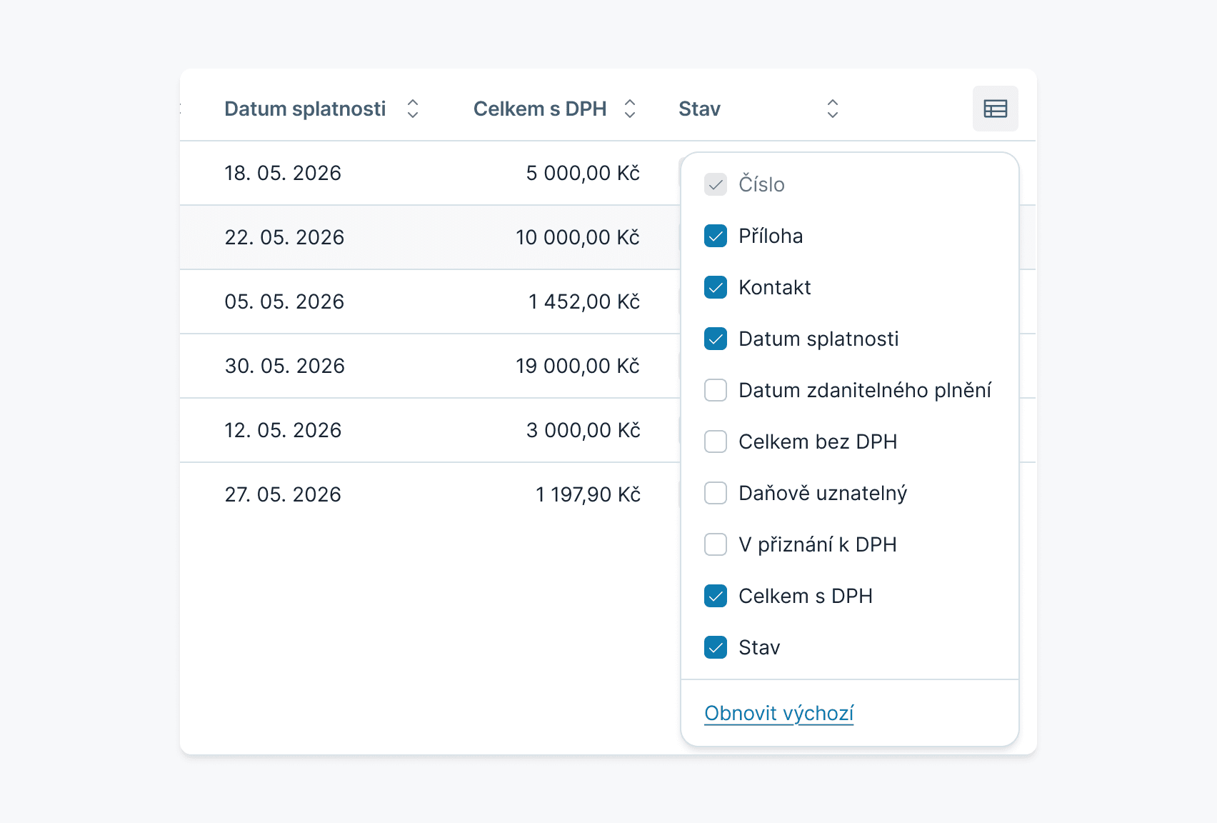
Default columns | Eight, half of them for the accountant | Six, with status; the rest in settings |
Column settings | No way back to the default | An “Obnovit výchozí” (restore default) link |
Empty cells | Blank, as if it failed to render | A light grey dash |
Phone layout | Picked by device name, so narrow windows break | Picked by screen width |
Opening a row on a phone | Only a 30 px arrow | A tap anywhere on the row |
Same widget, honest numbers
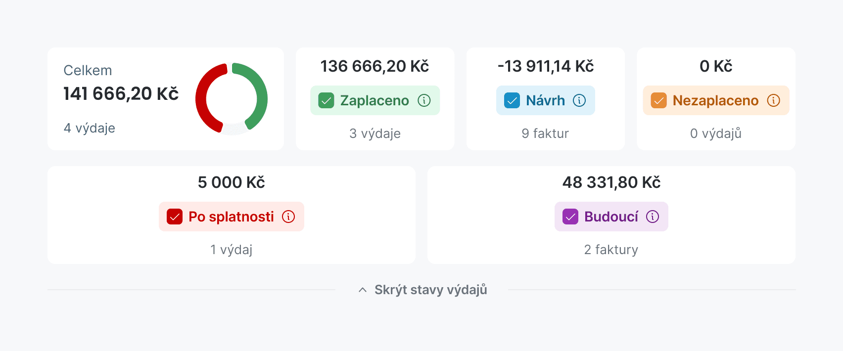
The CEO asked to keep the summary bar above the list as it was: a total with a donut and a tile per status. I kept it and fixed how it behaves.
Change | Before | After |
|---|---|---|
Status tile | Only the 16 px checkbox is clickable | The whole tile toggles |
Total and donut | The whole period, ignoring filters | Only the statuses left on |
Tile with zero | Can’t be switched off | Works like any other tile |
Donut tooltip | The chart library’s default | The design system’s tooltip, named like the tile |
The total was the one number on the bar that lied about the table right under it.
The filter I didn’t build
Faceted filters are where our lists are heading, and I had already built the chip and a working faceted row. Then I checked the current filters: on the invoice list, 100,000 views produced zero dead clicks on the status tiles.
By RICE, facets lost for now. Filters are the most critical control on the page, and the clunky ones we have could still hurt less than experiments on them. Our core user is a sole trader with one or two invoices a month who doesn’t want to relearn a screen. Facets stay on the roadmap.
Handoff
Every rule lives in the design system repo as a spec for people and a manifest the repo validates. The spec also lists what production does today, so the move to React doesn’t bring the old behaviour back.
What it changed
Every table I build now comes out of one component, so screens come together faster (and all my tables are pretty now). There are no after-numbers yet, because the page isn’t in production.
Until it ships, this is a very well-documented hypothesis.
Also I did facelift for landings, but its a whole new story… 👀
