

UX for a B2B app I couldn't see running
Cortiva
Cortiva is an invoice automation tool for accountants — OCR, multi-level approvals, ERP sync. I joined as a remote consultant with no staging, no design files, and no user access. From discovery calls and screenshots, I restructured navigation, filtering, and field-level workflows.
Context
I joined the project as a remote UX consultant working directly with the CTO. No access to users, no design files from previous iterations, no staging environment. My input came through video discovery calls, screenshots from the live product, and short async exchanges. The solutions I delivered were framed as "this is how it could work" — visual logic on screenshot-based mockups, ready for the team to validate and implement.
Working pipeline
Each problem followed the same five-step process:

The constraint shaped the approach: because I had no direct access to users or files, solutions had to be self-explanatory. The logic had to be readable from a mockup. Documentation had to replace the conversations I couldn't have.
Navigation redesign
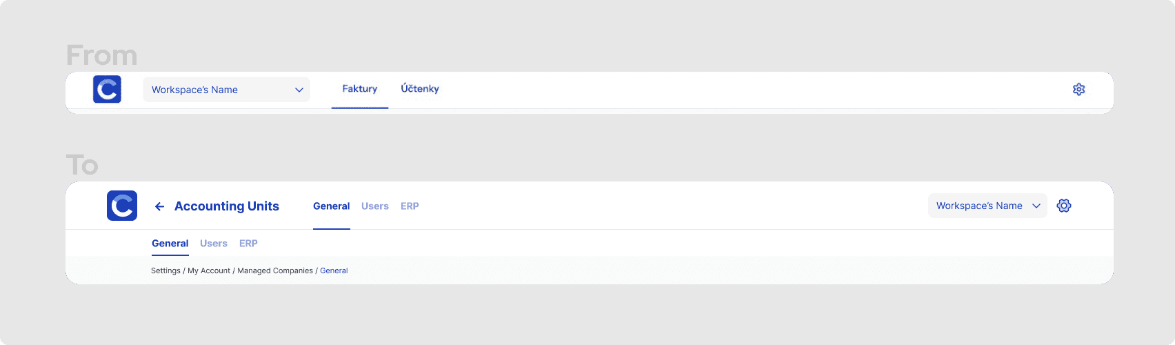
The crowded bar
The existing navigation mixed elements from different hierarchy levels in a single tab bar at the top. The CTO's position was clear: no side menus. The current solution wasn't scalable — adding sections meant adding more tabs to an already crowded bar, and the active/inactive states were inconsistent in a way that increased cognitive load.
Restructuring layers
I restructured the navigation into two levels. The primary bar holds the main sections (Faktury, Účtenky). A secondary tab bar — visible only when the selected section has distinct subviews — sits directly underneath, handling the second level of hierarchy. This follows a standard pattern: each level reflects its own context and collapses when not needed.
On the right side of the top bar: Settings and the Workspace selector. On the left: the logo (always returns to the main dashboard) and a Back button that appears only on nested views — not as a replacement for breadcrumbs, but as a semantic one-level-up action.
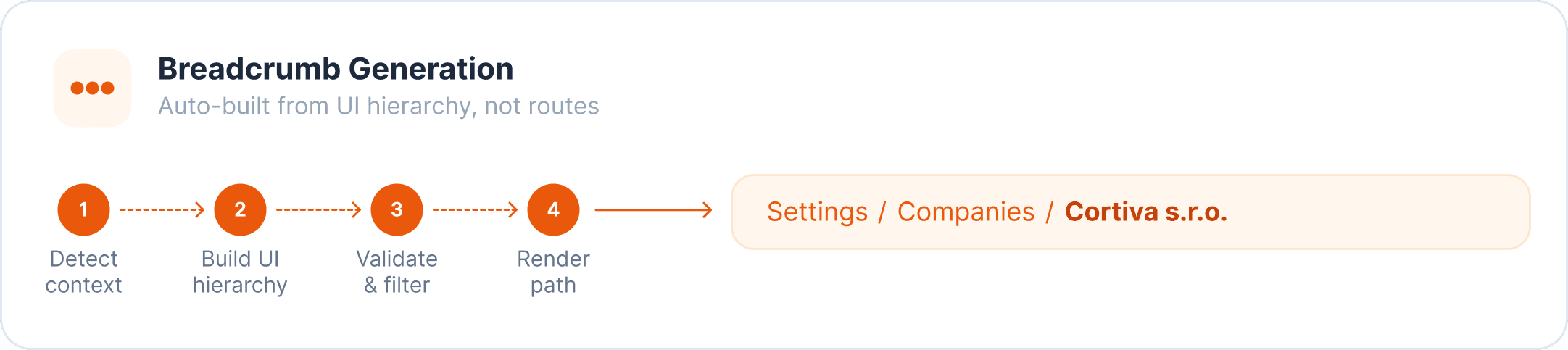
For the third level of hierarchy, three consecutive tab bars would have been too much. I resolved this through breadcrumbs and documented the logic for when and how to use them: show only on inner pages at depth ≥ 2, never duplicate the page title, never replace the back button, don't reflect technical route parameters.
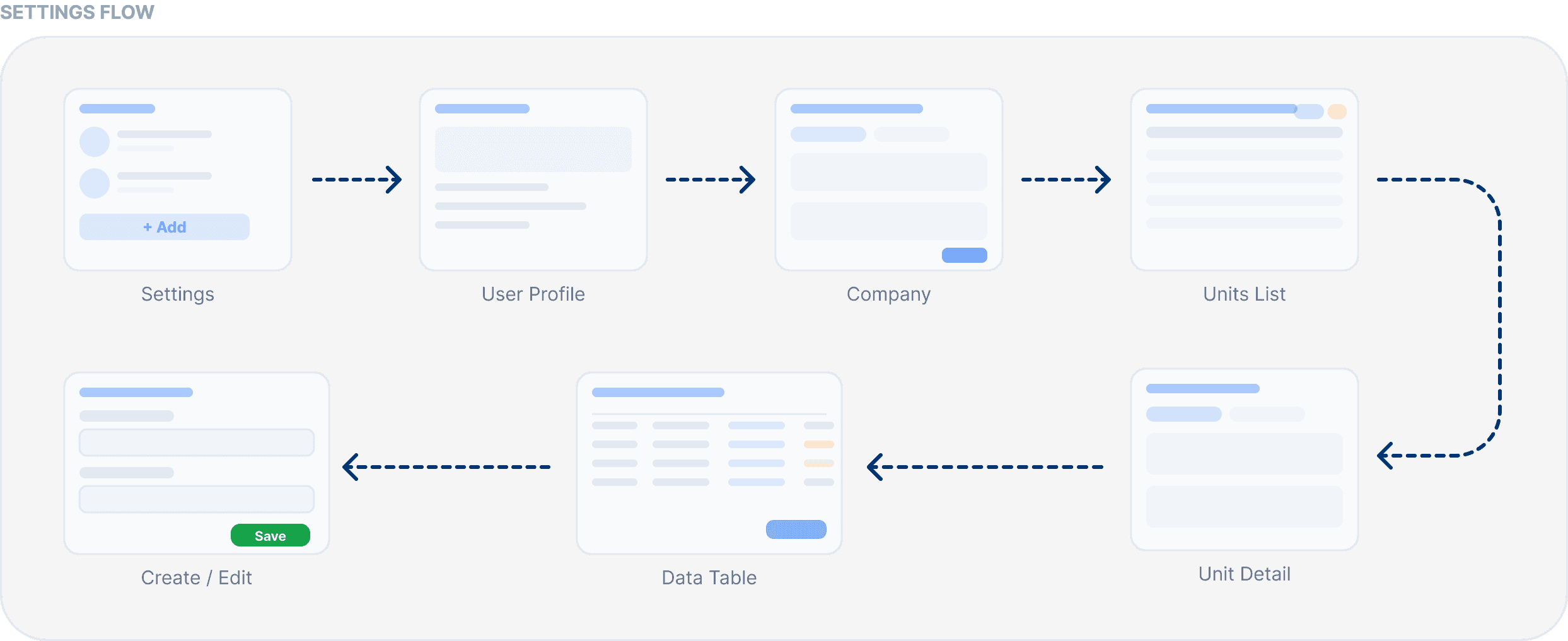
I also structured the Settings flow — separating workspace settings, personal settings, and app settings — and identified which list views benefit from a quick filter or preview, so users don't have to open every row to find what they need.
Decision logic
Touch zones in the existing top bar mixed active and inactive elements on the left side. This is a non-standard pattern: primary navigation conventionally separates interactive from structural elements. Fixing this wasn't just aesthetic — it reduced the number of decisions a user has to make on each screen load.
The breadcrumb documentation was a direct response to a recurring issue: the team kept asking "should we show breadcrumbs here?" Having a documented decision tree (based on hierarchy depth, navigability of each level, and whether a back button already covers orientation) meant that question had a repeatable answer.
Advanced filtering
Inconsistent inputs
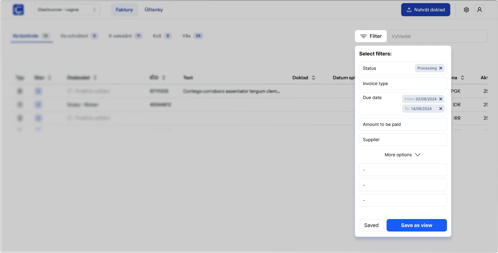
The product had filtering functionality, but it lacked a consistent interaction model. Different filter types — dates, numbers, status options, free text — needed different input behaviours, and there was no unified approach to how applied filters were displayed or cleared.
Unified filter model
I defined input logic per filter type: date fields use a range picker (from–to); numeric fields use an input with a comparison operator dropdown (greater than, less than, equals, between); option fields use a multi-select checkbox list; text fields support "contains / starts with / equals" logic.
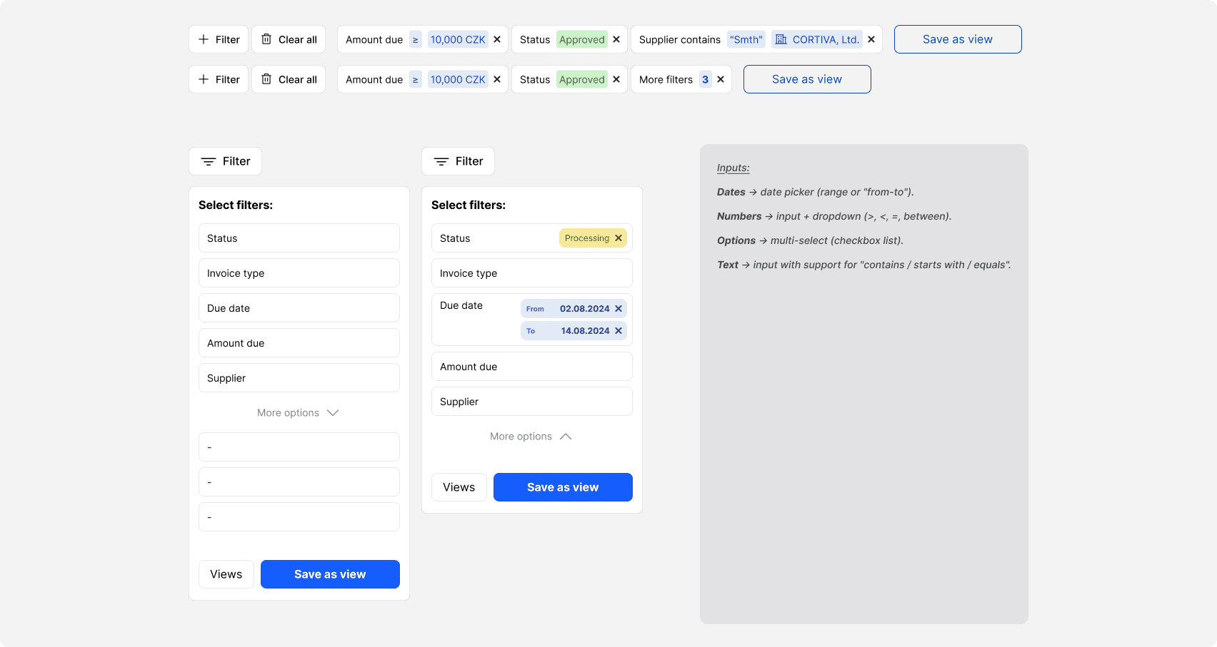
The panel design keeps the filter list visible as the user builds a query: each filter type appears as a row, inactive ones shown at reduced opacity, active ones highlighted. A "More options" section handles lower-frequency filters without cluttering the primary view.
Why it matters here
Accounting workflows are repetitive. An accountant checking invoices for one client will apply the same supplier filter, date range, and status combination multiple times a week. A system that makes that two clicks instead of six — and remembers the configuration — reduces friction at the task level, not just the interface level.
Quick filtering (filter chips)
Buried common actions
The advanced filter panel is powerful, but it's several clicks deep. For the most common filtering actions — filtering by date, supplier, document number — users shouldn't have to open the full panel every time.
The search bar and the advanced filter button were previously placed in the secondary navigation bar. This created a visual and logical problem: filtering is a table-level action, not a navigation-level action. It belonged closer to the data it controls.
Chip strip solution
I moved the filter controls to a dedicated strip between the navigation bar and the table. Visually, this strip uses a white background with a bottom stroke that matches the navigation bar — it reads as part of the nav system while being distinct from the table below.

Quick filter chips sit in this strip. Each chip controls one filter dimension (date, supplier, document number, status). Chips show their current state without interaction — if a filter is active, the chip label shows the applied value. Clicking a chip opens a lightweight popover: a date picker for date fields, a dropdown for option fields, a short text input for text fields. No more than two controls per popover. The goal is one interaction to apply a common filter, not a full panel.
The "More filters" button remains for low-frequency and complex filters. Chips are not a replacement for the advanced panel — they're a fast lane for the top five actions.
The specific chips weren't chosen arbitrarily. The product has a multi-level approval workflow — invoices move through statuses like "to check", "to approve", and "sent to ERP". Each approval level has its own queue. Quick filters map directly onto these stages: an accountant at the approval level doesn't need to filter by supplier — they need to see everything at their stage, fast. Adding status icons next to filter labels (not just text) reinforces this: in a list of dozens of invoices, a visual indicator is faster to scan than a word.
I referenced Stripe's transaction filter pattern as a direction: same principle of visible chips above a data table, same separation of quick-access and advanced filtering.
Constraints and trade-offs
Most users work on small screens. The chip strip had to stay compact — max three chips visible at a time before overflow handling, with a clear way to see all active filters. I documented this as a max-3 visible rule, with additional active filters shown as a count badge on "More filters."
The positioning decision (third level, not second) was a deliberate trade-off: placing it in the secondary nav would have blurred the line between navigation and data controls. Moving it down kept the navigation semantically clean.
Pinned settings on the OCR control screen
Too many fields
The invoice detail screen shows data extracted by OCR — up to 58 different fields across sections like basic information, amounts, VAT, line items. Users at each approval level tend to check the same small subset of fields repeatedly. There was no way to surface those fields without scrolling through the full list.

Pinned fields
I designed a "pinned fields" section at the top of the screen that shows duplicates of fields the user has marked as priority. The pinned section is only visible once at least one field is pinned — it doesn't take up space when empty.

The feature was designed with multi-level approval in mind. Different users at different approval stages check different fields — a first-level reviewer cares about supplier and amount, a second-level approver might prioritise VAT and ERP mapping status. Pinned fields give each person their own fast lane without changing anything for anyone else.
The pin action is triggered from the right side of each field row. This required a decision: where in the UI to place the toggle without adding a new control or cluttering the layout. The existing row included a lock icon (used for a view-locking feature that was rarely used in practice). I replaced the lock with the pin toggle — the same interaction zone, a more useful action.
State logic: outside settings mode, unpinned fields are shown at reduced opacity; pinned fields are fully visible with a pin icon. On hover, unpinned fields become fully visible with an "unpin" icon preview — communicating what the next state will be before the user commits. Inside settings mode, the pin icon is always visible to make the action discoverable.
Why pin, not star
Heart, star, bookmark, or pin? The choice mattered because each carries a different mental model. Hearts and stars are associated with likes and ratings — social media and e-commerce contexts. Bookmarks suggest saving for later. Pin has a more neutral "keep this here" meaning and is commonly used in productivity and data tools (pinned tabs, pinned messages, pinned columns in spreadsheets).
The accounting context made pin the right choice. It doesn't suggest preference or saved-for-later — it suggests "this is part of my regular workflow."
Reflection
This project was mostly about designing in the absence of typical inputs. No user research access, no design history, no staging environment. The discovery calls were the research. Screenshots were the prototype material. Documentation replaced the alignment conversations I couldn't have in real time.
What this forced: every decision had to be defensible from first principles and standard conventions, because there was no user data to fall back on. Competitive benchmarking and interaction pattern research carried more weight than usual.
What I'd do differently: push earlier for even partial access to users — even two or three interviews would have changed the confidence level on some assumptions, particularly around which quick filters to prioritise and how accountants actually use the OCR screen in practice.
The pipeline worked. Solutions were delivered in a format the CTO could use directly in product discussions and hand off to developers without additional translation.