

MVP landing page without the interface
Cortiva
A landing page for a fintech MVP with one hard constraint: the UI couldn't be shown. Built a sales-ready page that explains the product, earns trust with accountants, and works without a single screenshot.
TL;DR
The CTO of Cortiva found me on LinkedIn. His startup was approaching MVP launch with one hard constraint: the backend worked, but the interface couldn't be shown publicly. The task was to build a landing page that explains the product's value, builds trust with a skeptical accounting audience, and works as a sales tool in client meetings — without a single screenshot of the actual app.
Context
Cortiva automates accounting document workflows — invoice processing, ERP exports, error checking. The kind of tool that makes sense the moment you see it in action. Except we couldn't show it in action.
The communication happened over quick calls and WhatsApp. No brief document, no marketing team, no existing copy. Just a CTO who understood the product deeply but had never had to explain it to someone outside the company — and a deadline.
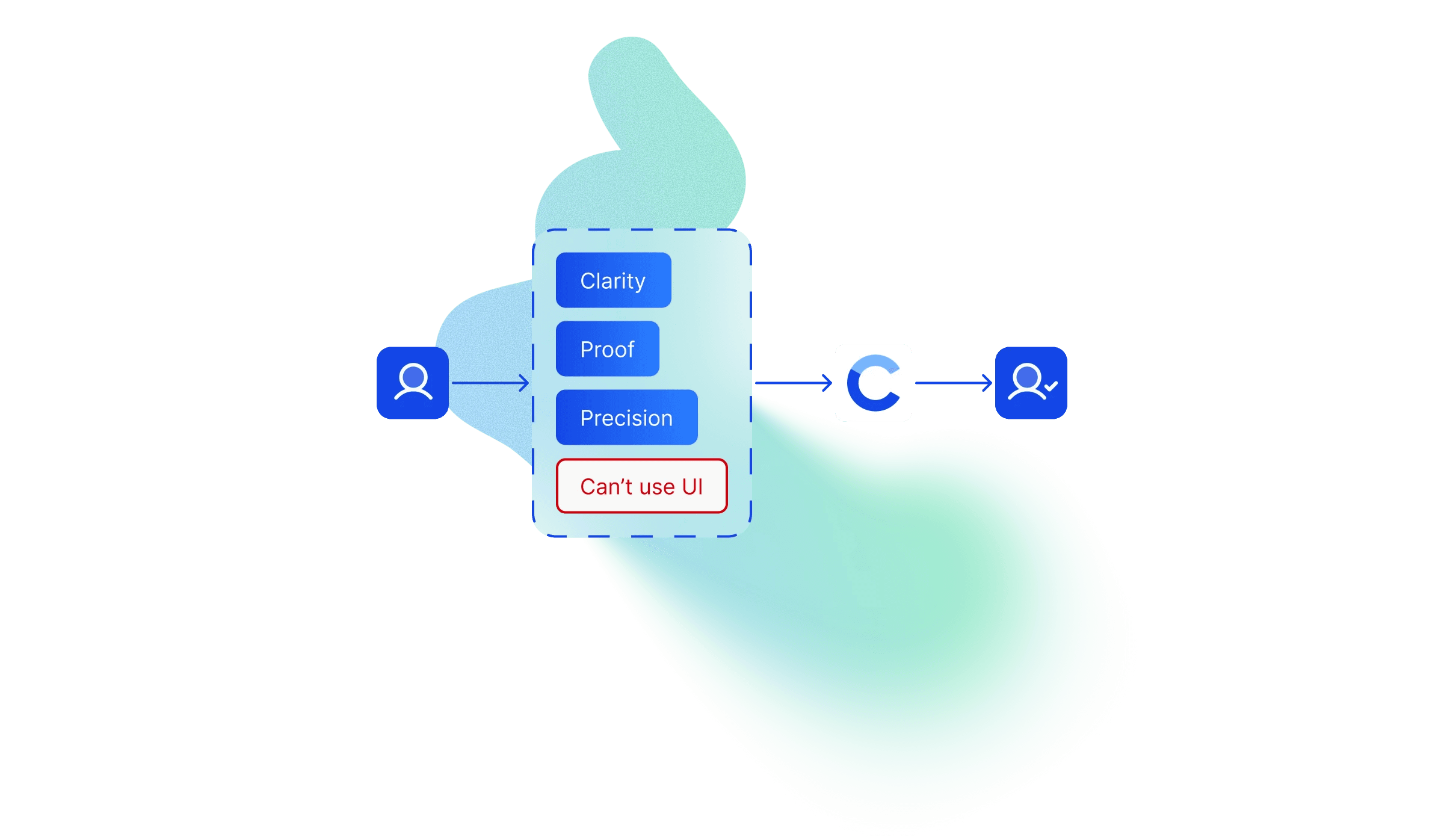
The constraint was real: the interface was strictly off-limits for public materials. And the audience — accountants — are among the hardest to convince without a demo. They're trained to look for precision and proof. "Trust us, it works" doesn't land.
So the task was simple in wording and difficult in execution: explain the service without showing the UI.
Research and immersion
Over 2–3 short calls, I mapped what I needed to know: who the audience is, what routine the product automates, which benefits to state plainly and which to emphasize, and what exactly could and couldn't be shown.
Then I analyzed four competing document automation tools. Not to borrow their structure — to find the gaps. What do they all fail to say? Where does the friction for accountants actually come from?
Three recurring pain points emerged across all of them:
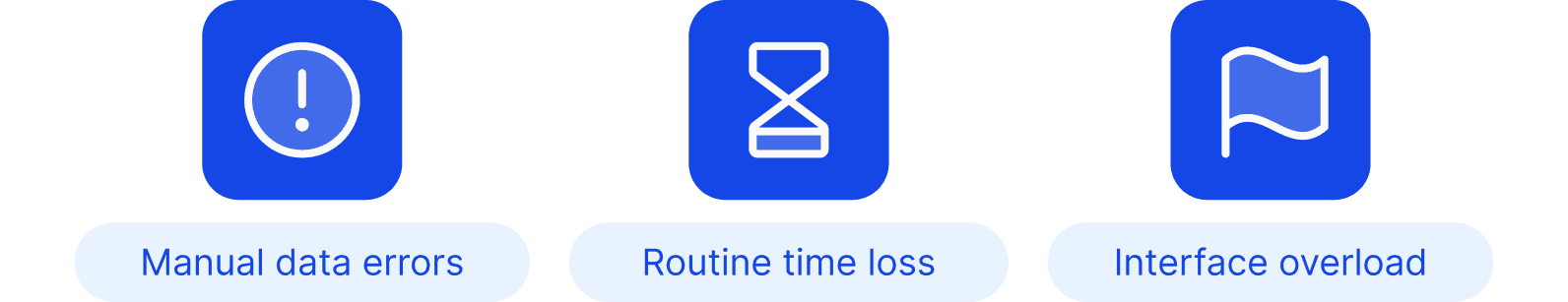
Errors from manual data entry. Human error in accounting isn't just inconvenient — it creates compliance problems. Every accountant knows this fear.
Time lost on repetitive processing. It's not that processing one invoice is hard. It's processing fifty of them every day.
Complexity of existing tools. Cluttered interfaces, too many steps, a steep learning curve, and the anxiety of implementing something new in a workflow that can't afford to break.
These three insights became the backbone of everything: the narrative tone, the section order, the language, the visual hierarchy.
Information architecture
Accountants don't browse. They scan for relevance and leave if they don't find it fast. I built the IA around one principle: no detours, no complexity, no moment where the user has to "figure things out."
The structure followed a strict Problem → Solution logic, designed so every section answers the question the previous one raised.
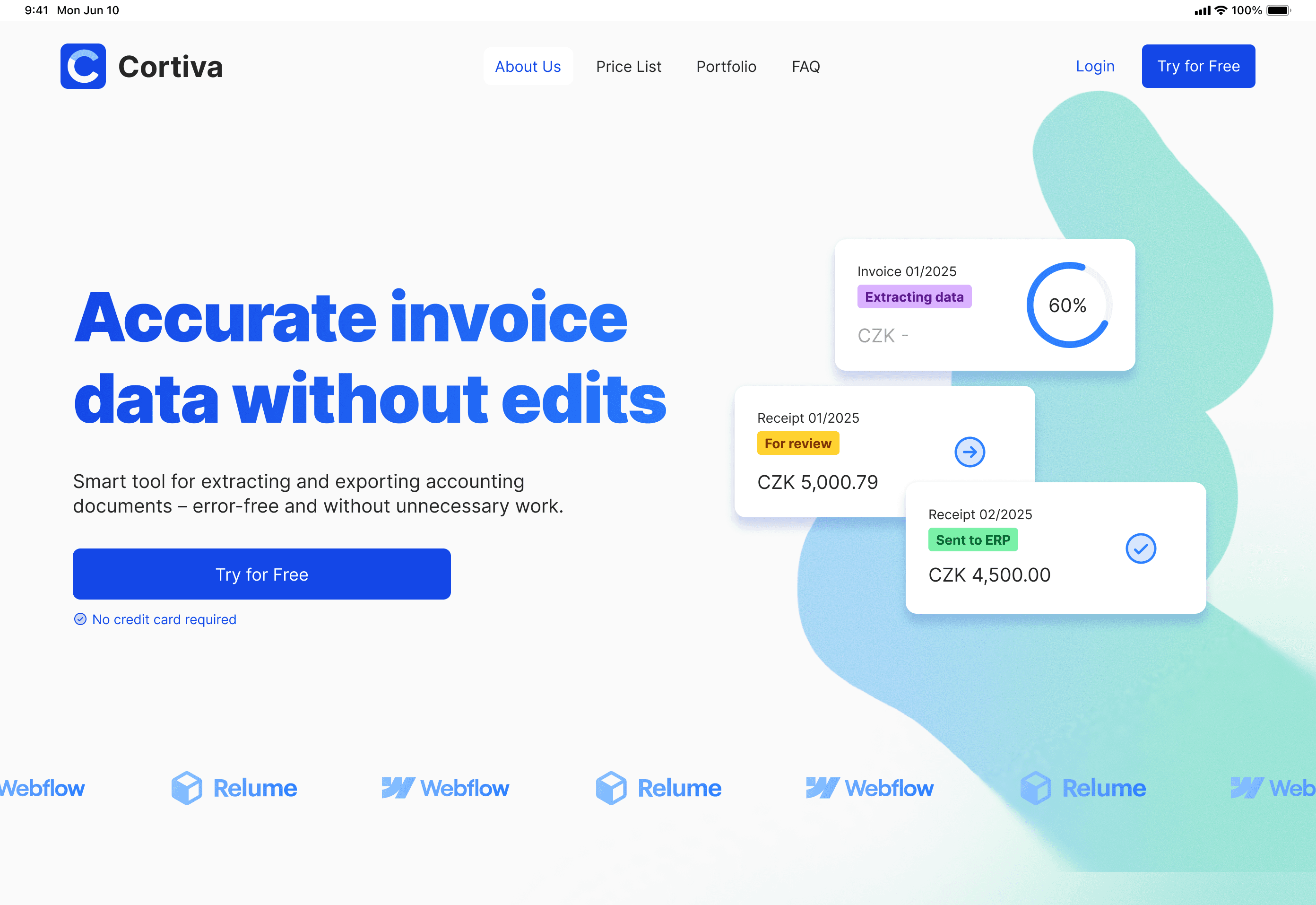
Hero. Pain → solution → CTA. The most direct possible message: here's what's wrong with your current workflow, here's how we fix it, here's your next step. No clever taglines, no abstract promises.
Key benefits. Three blocks, each addressing one of the pain points from research. Short, direct, recognition-first — the "that's exactly my problem" moment. The goal wasn't to impress, it was to make the accountant feel understood in the first fifteen seconds.
How it works. A 1–2–3 process explanation: Upload → Process → Export. Minimal text, focused only on actions. This section had to communicate "the product has real logic" without revealing the interface. It needed to feel like a step-by-step guide, not a marketing claim.
Visual demonstration block. The hardest section to design. More on this below.
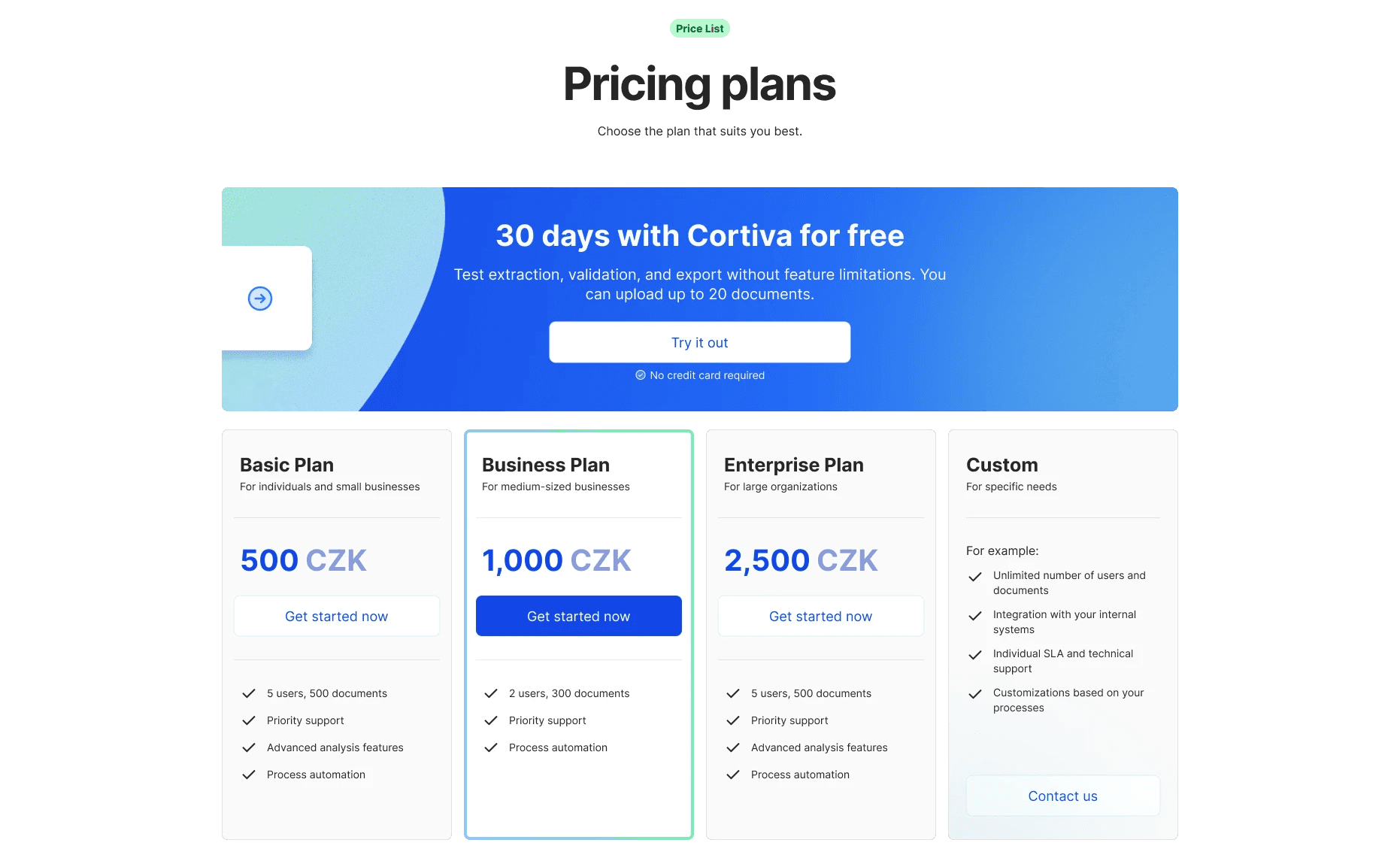
Pricing. Deliberately placed early, starting with the free plan. Accountants want to see terms before they invest attention — hiding pricing until the end reads as evasive to this audience. Transparency here is a trust signal.
Trust markers. Short testimonials and credibility signals. With no UI to show, these had to do extra work. The section was designed to lower the barrier for users who needed social proof before they'd consider registering.
FAQ. Objection handling in advance. Every question the CTO got repeatedly in meetings went into this section. Users who aren't ready to sign up often spend the most time here — it's where decisions get made.
Final CTA. A repeat of the hero action. By this point, the user has moved through the full argument. The CTA closes the loop.
The IA ended up doing more than organizing the page. The CTO used it as a framework to align the internal team on positioning — explaining the product to stakeholders who hadn't been in the calls.
Visual solution
Designing around the constraint
This was the core design challenge. How do you visualize software without showing the software?
The temptation is to fake it — create polished mock dashboards that look real but aren't. I ruled this out immediately. For a trust-sensitive audience like accountants, deception backfires badly the moment they realize what they're looking at isn't real.
The direction I chose was what I called "utilitarian clarity." No decorative elements, no overdesigned graphics trying to compensate for missing content. The visual language had to feel like the product itself: precise, clean, functional.
Abstract status cards. The key visual element. Instead of dashboard screenshots, I designed small abstract UI fragments — miniature cards showing documents with labels like "Ready for Review," "Sent to ERP," processing percentages. They were abstract enough not to misrepresent the interface, but specific enough to show that the product has real logic: a document moves through stages, gets checked, gets exported. This is what the product does. You see it without seeing the UI.
Soft abstract shapes. Used in the background of several sections to create visual rhythm and guide the eye down the page. Not decorative — structural. They give the eye somewhere to travel between text blocks without adding visual noise.
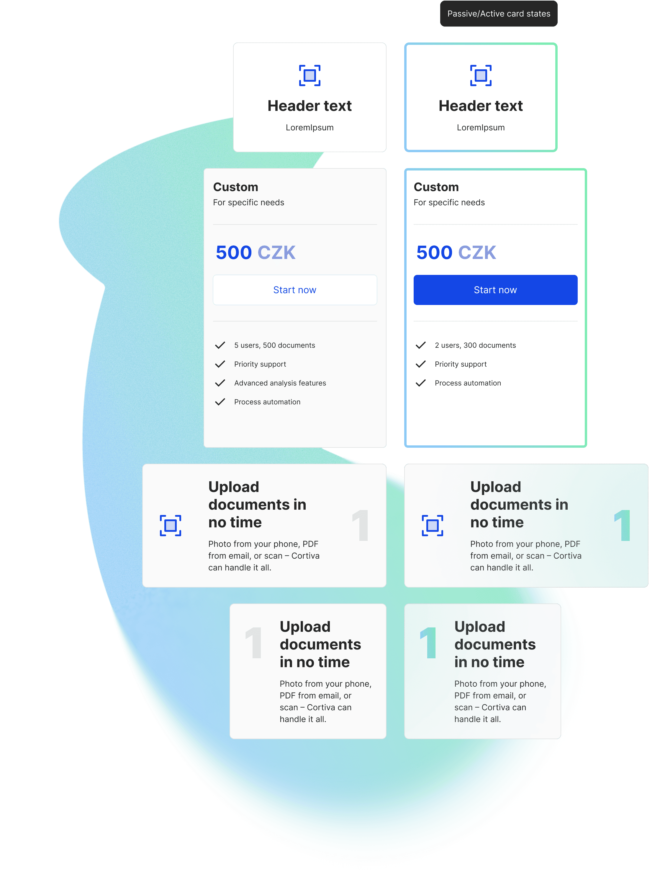
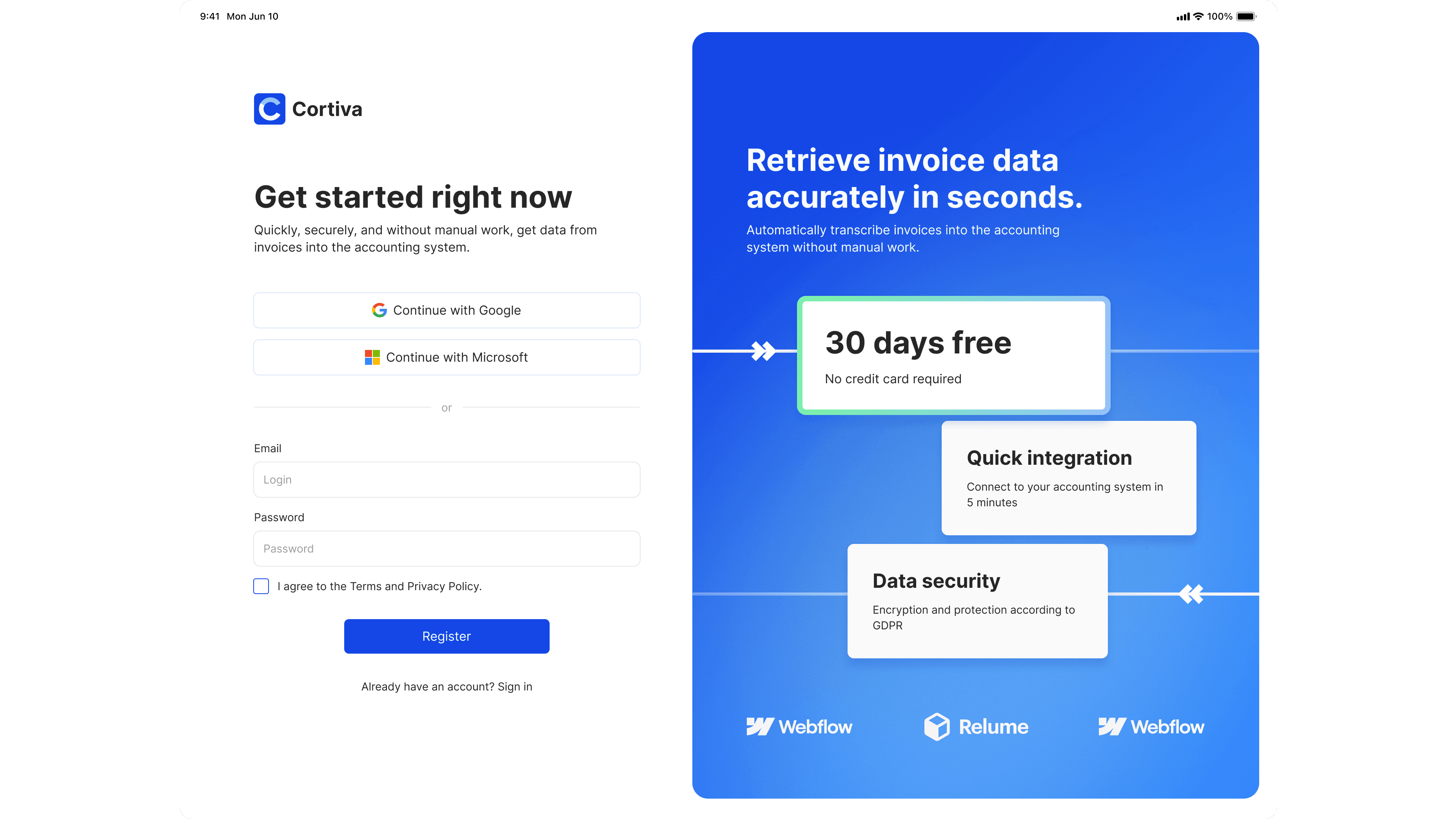
Color system. Calm, whitespace-heavy, professional blue as the accent. The accounting world associates blue with stability and trust. I didn't try to be clever here — the right signal for this audience is reliability, not personality.
Motion
Midway through the project I realized the page risked feeling static. Abstract shapes and status cards help, but a long page without movement loses attention at the wrong moments.
I hadn't worked with Lottie before. I learned it during the project and implemented a custom animation for one of the key sections — the "how it works" block. It added exactly the rhythm the page needed: a subtle sense that the product is doing something, even when you can't see it.
Deliverables
The final package went well beyond "a landing page design":
A strategic copywriting framework written in accounting-specific language — not generic SaaS copy, but text that speaks directly to the professional vocabulary of the audience.
A UI kit covering typography, color, and components — built not just for the landing page but to scale into the future app interface. The developer had a foundation to build on, not just static screens.
A fully responsive landing page design for desktop and mobile, with additional pages: Legal, 404, and a Login/Signup screen with an application transition banner.
A high-fidelity interactive prototype used to align me, the CTO, and the developer before anything went into code. It let us test the rhythm of the page and validate that the status card concept communicated the right thing — that the absence of real UI wasn't felt as a gap.
Reflection
The visual implementation changed after handoff. The copy was adjusted. Some sections were restructured for development reasons. This is normal for early-stage products — things move fast and the design can't be precious.
What held was the structure: the argument, the sequence, the language, the logic of why each section exists. That's what the team carried forward. The landing page became a synchronization tool — internally for positioning, externally for client conversations.
For early MVPs, the most durable design work isn't the one that looks best in a portfolio screenshot. It's the one that reduces uncertainty enough for the team to move forward.
If you understand the user's pain deeply enough, you don't need the interface to earn their trust. You just need to speak their language.