Plant Care App
A study UX/UI project focused on building a calm and accessible mobile interface for plant care — using structure, consistency, and early design system logic to reduce friction and cognitive overload.
#hero —
#nav-trigger-1 —
This was a study project. No client, no KPIs, no branding kit — just a goal: build something structured from scratch and finally understand what “design system” means.
I picked a plant care app because the context felt close — and I guess that’s how most people choose their first real project. Something you already care about, just enough to want it to make sense.
Planty became my testbed for system thinking. I wanted to go through the full flow — from user research to prototype — but more than that, I wanted to stop guessing what makes an interface consistent.
#context —
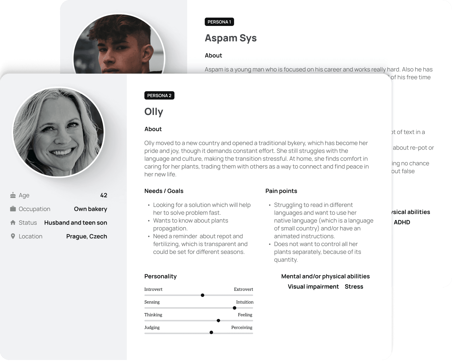
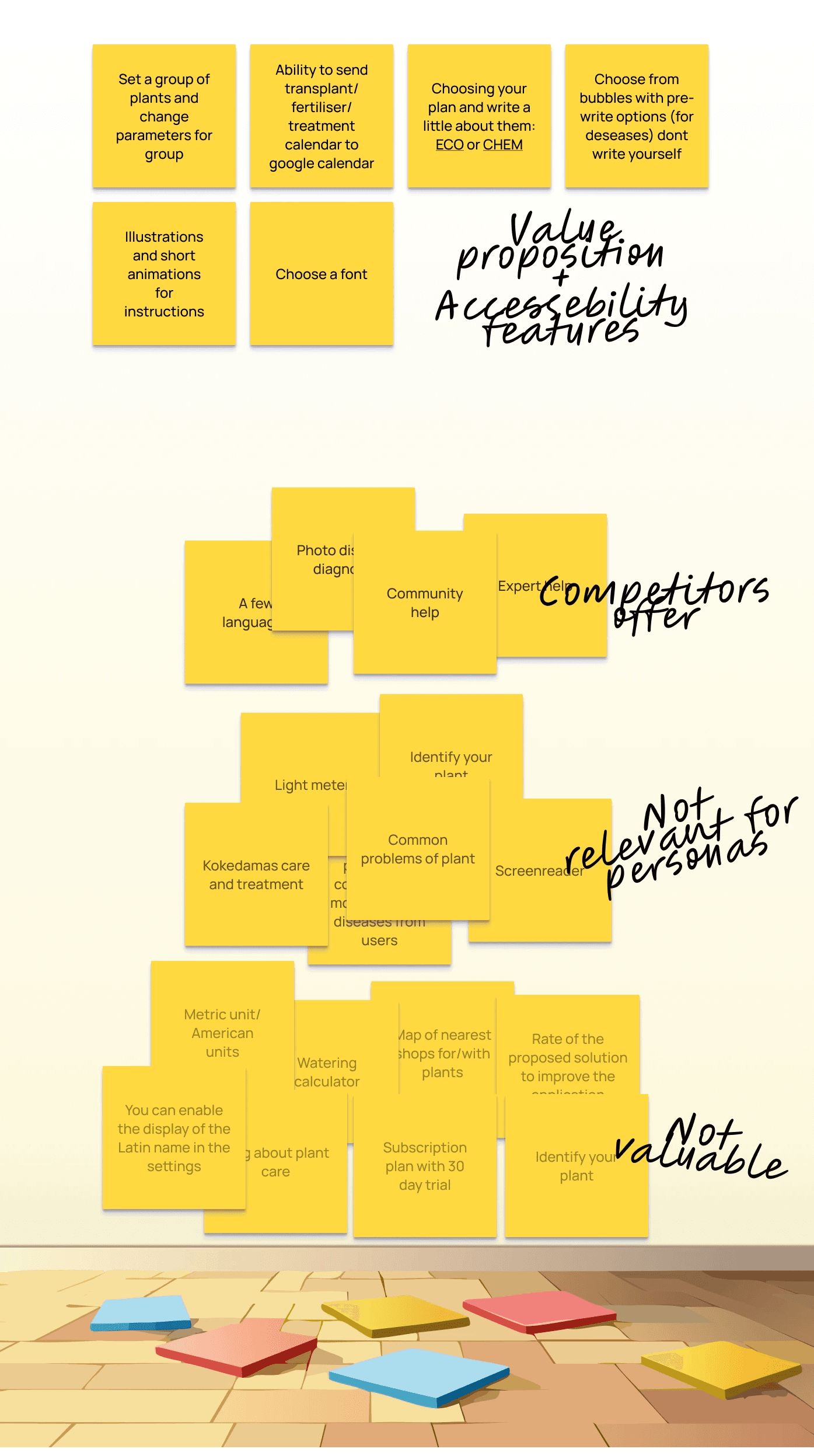
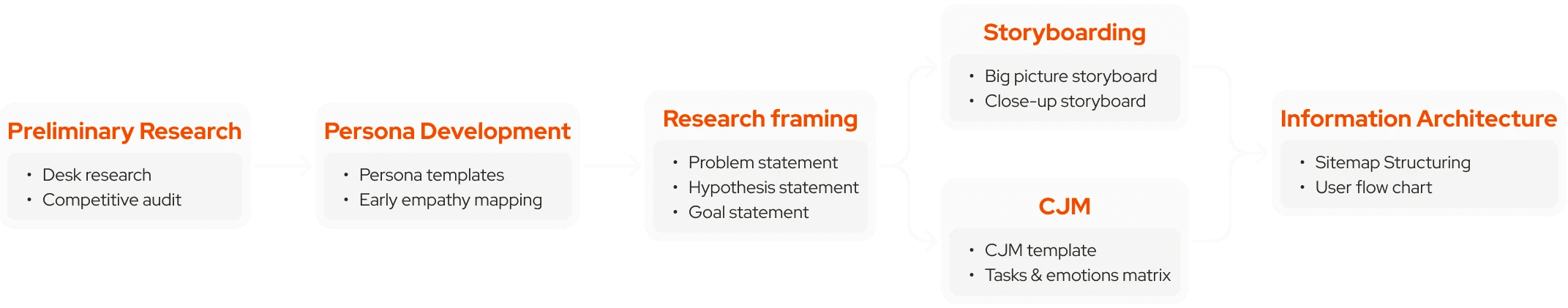
I did what a proper UX student is supposed to do: two personas, a full journey map, competitor audit, IA, storyboards, frameworks.
The research wasn’t pointless — but I knew from the start that no matrix would help if the interface couldn’t carry the logic on its own.
So I used all this not to validate features, but to draw boundaries.
UX didn’t give me answers — it gave me constraints to work with. That’s where the structure came from.
#research —
Iteration one: where it fell apart
The first version was what you expect from someone who just learned UX terms: cluttered, visually unbalanced, no rhythm, too many things happening.
I tested early lo-fi screens on actual humans via Useberry. It was the first time I tried collecting feedback, and I had no idea what I was really asking.
That’s when I realized how little I actually knew about the flow of understanding in a product. And how much of “UX research” at this stage is just slowly learning where you were wrong.
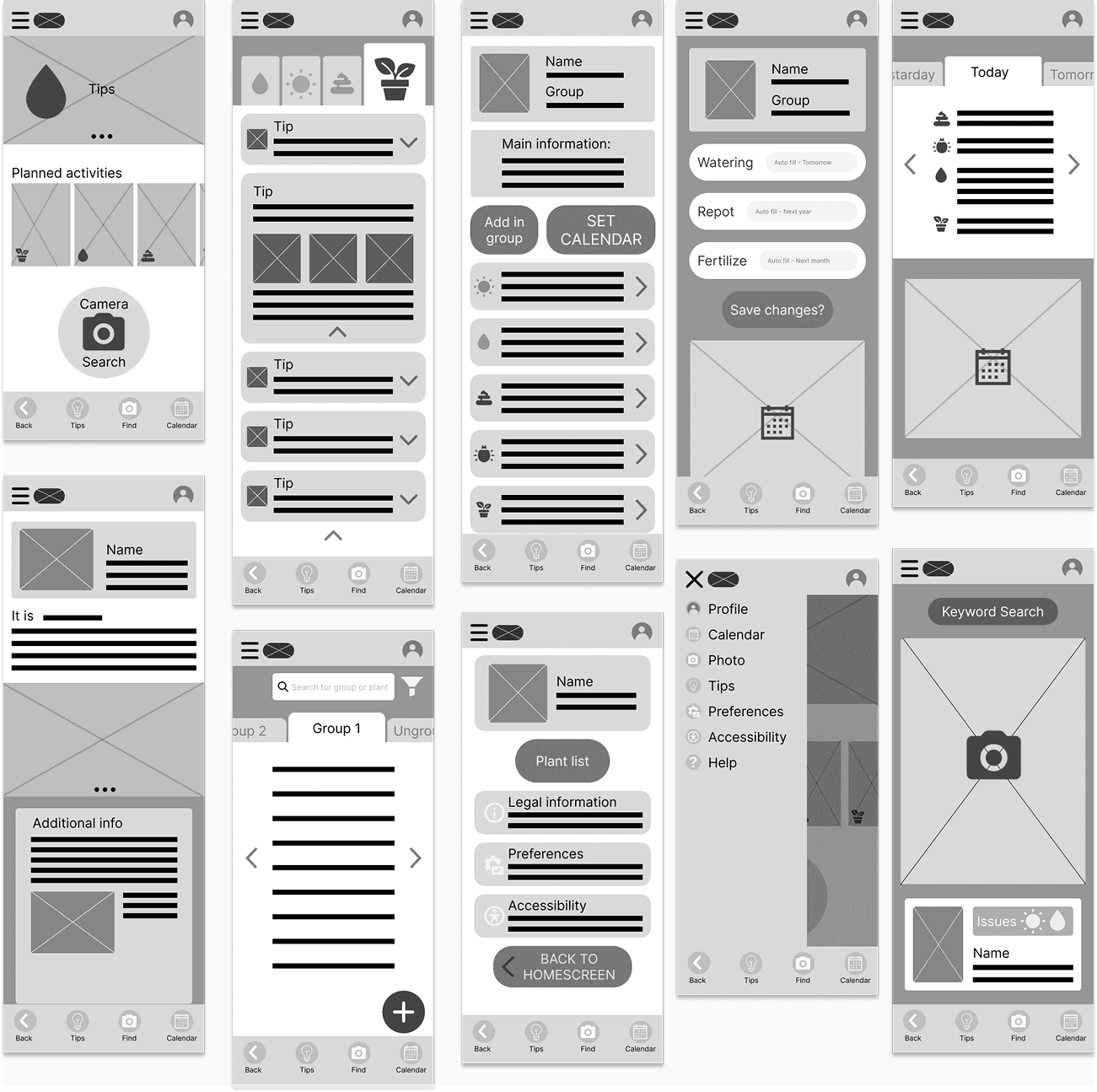
So I did the only sensible thing:
Deleted everything and started over.
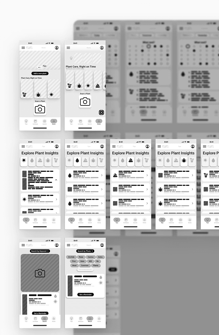
Iteration two: structure starts to speak
This time, I focused on rhythm and limits. Each screen had fewer elements. Actions followed clearer patterns.
I didn’t build components yet — but the idea of structure started forming.
The kind of structure that tells a user what’s important before they even start reading.
#structure —
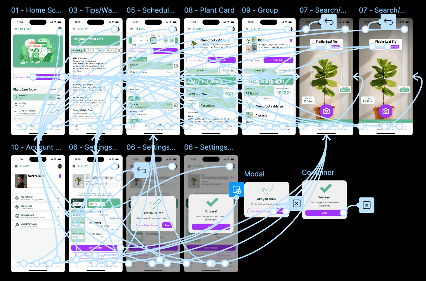
Design system... or at least the attempt
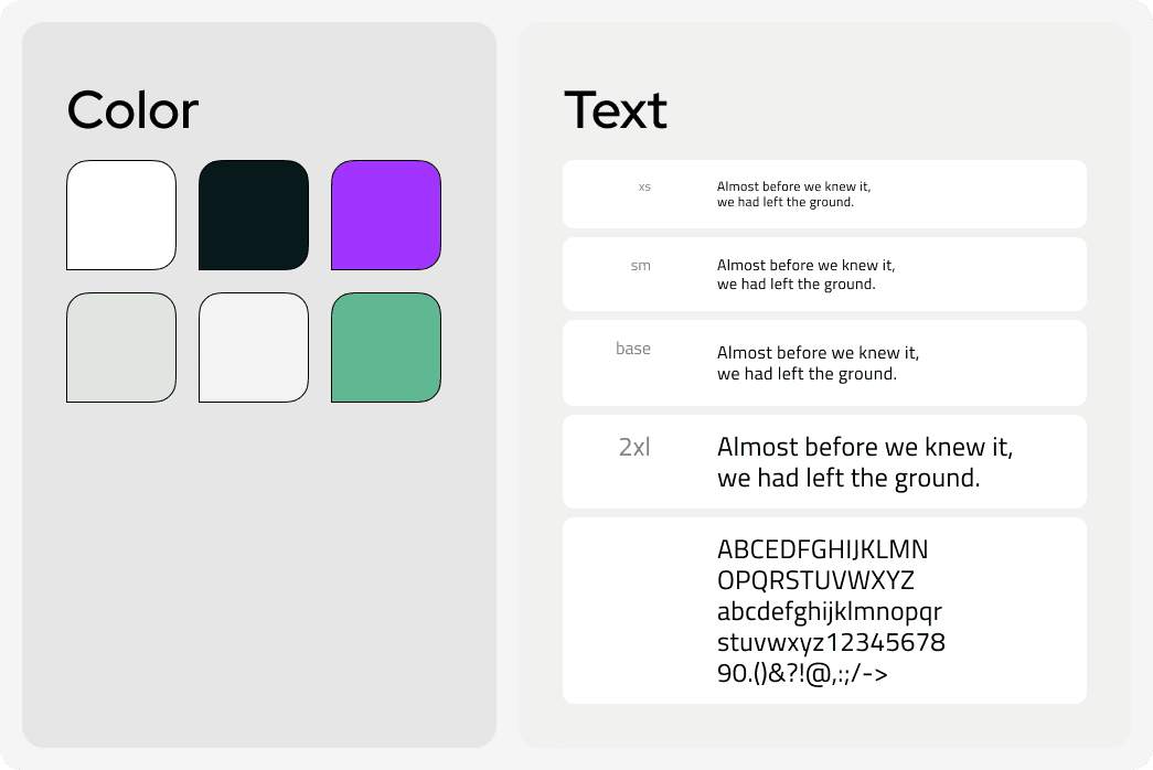
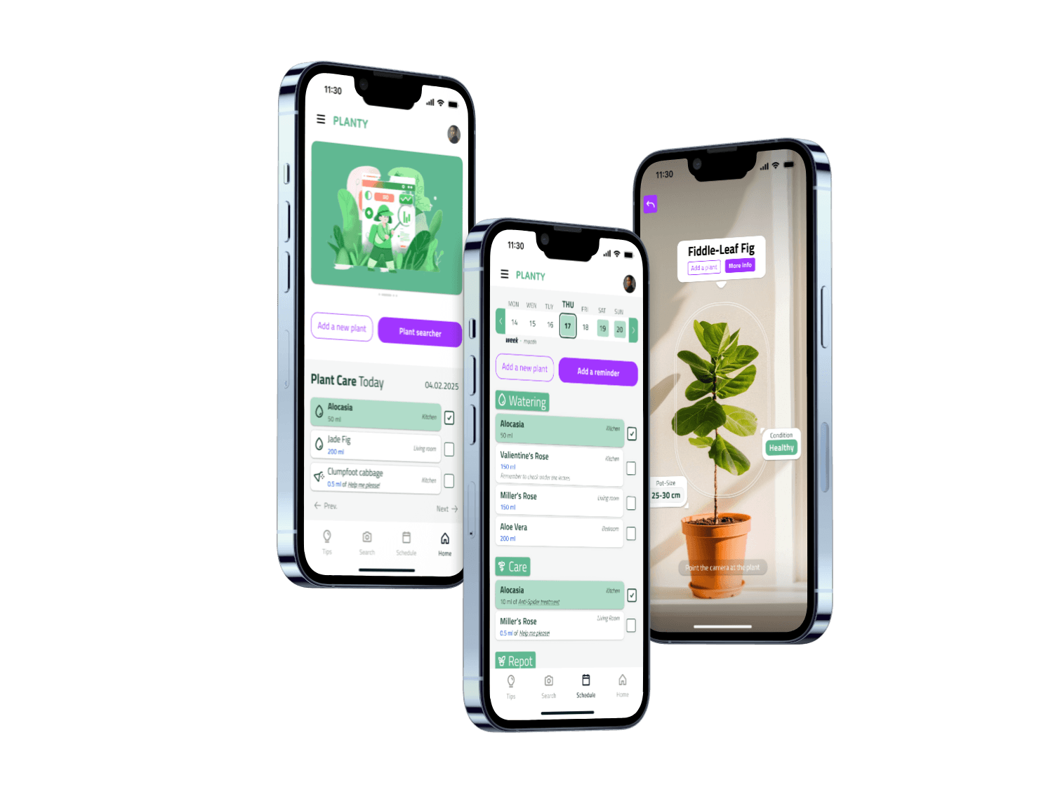
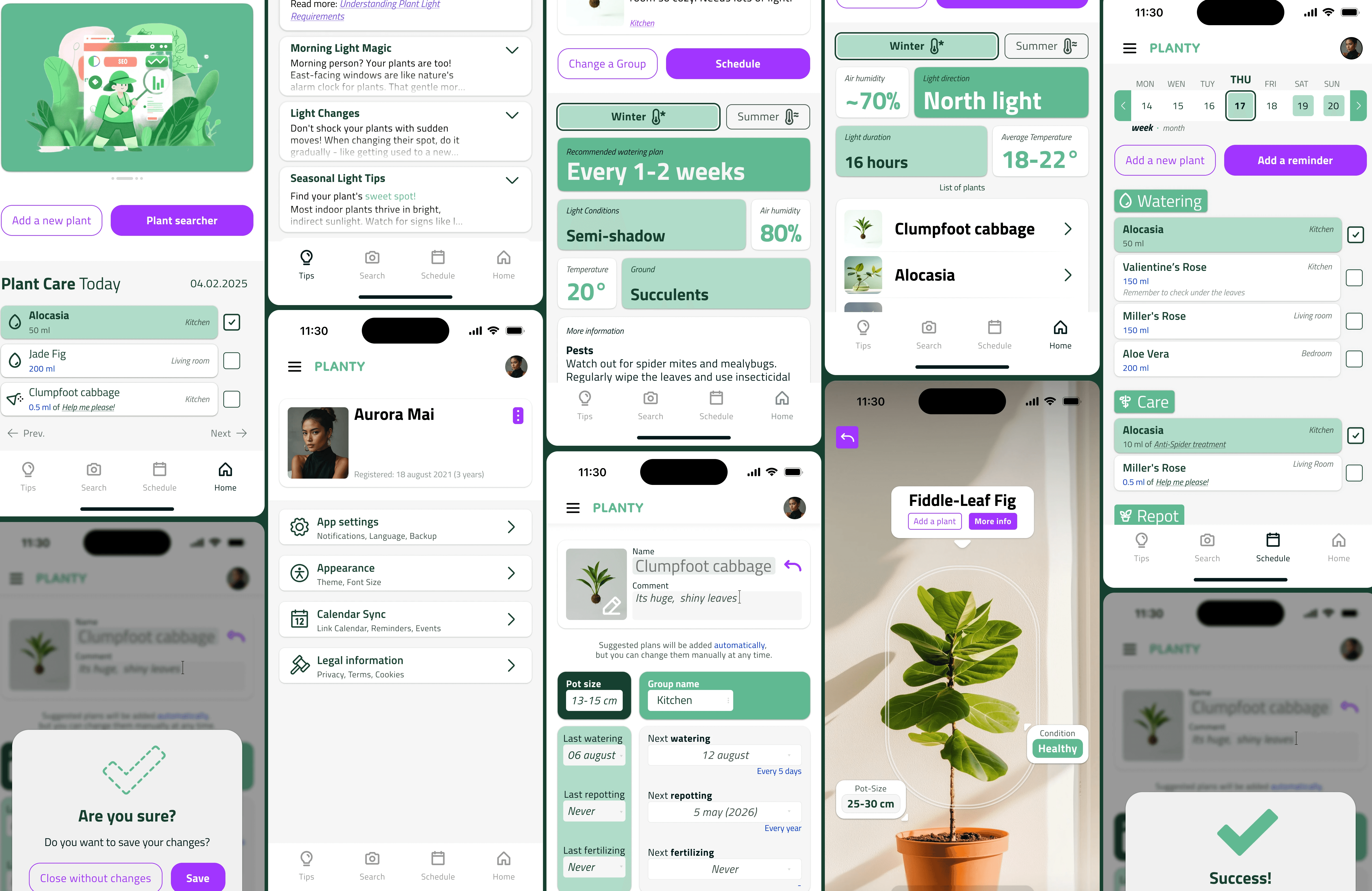
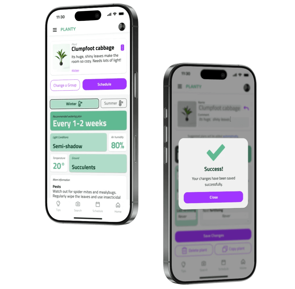
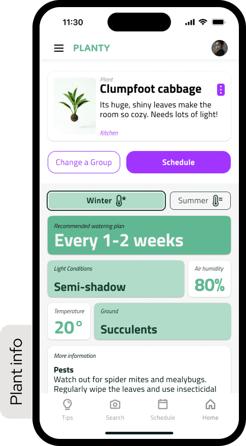
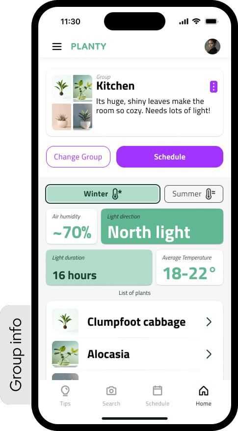
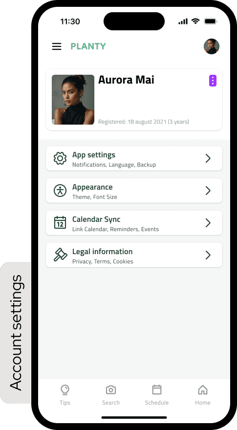
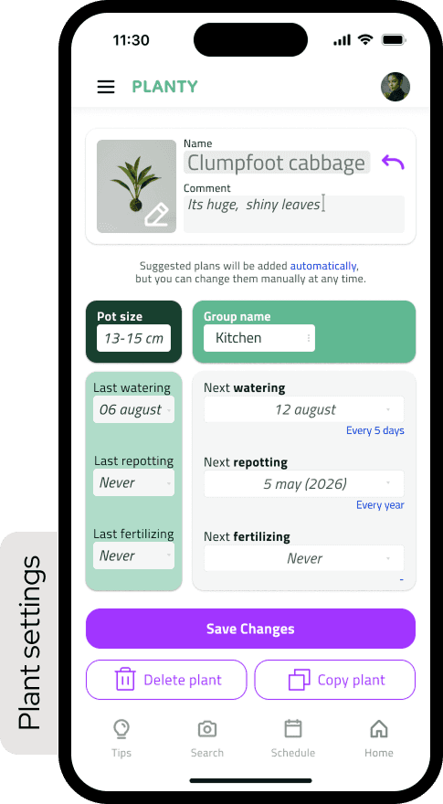
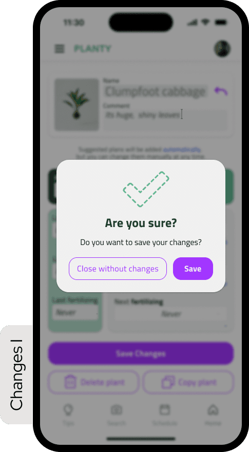
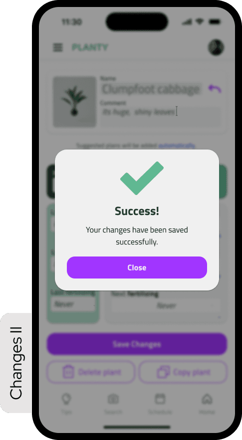
A full mobile flow designed to stay simple, readable, and consistent — from home to scheduling to plant details.
Each screen builds on the same structural rules, helping the interface feel calm and connected.
The result: a compact but complete prototype with twelve clear, usable screens.
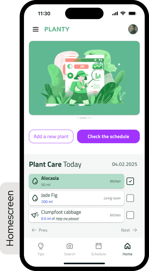
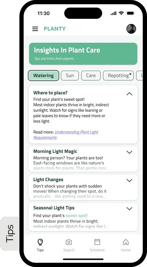
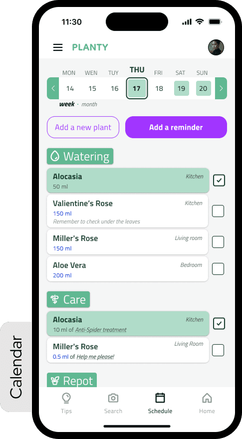
#system —
#form —
In the end, I built a clickable mobile prototype in Figma with 12 core screens.
The UI was still a bit fluffy in places. But it held together — structurally, visually, and functionally.
Using constraints to guide decisions — especially when scoping features.
Prioritizing accessibility over visual complexity.
Applying component logic early, inspired by Fluent 2.
No more shadows — that was the last time I used them in mobile UI.
Too much color in early screens — it clashed with clarity and accessibility goals.
Skimming over foundational structure — made prototyping harder than it needed to be.
Simplify visuals from the start.
Spend less time on templates, more on real research.
Build with a clear system of states, layouts, and tokens.
Add better onboarding for new users.
#context —
#reflections —