Car rental
Certifikát Google UX

#hero —
#nav-trigger-1 —
Why redesign this?
I found this site while casually browsing Google Ads. It felt outdated, visually messy, and awkward on mobile — not ideal when you're deciding who to trust with a rental car.
The booking form was crowded, button states were inconsistent, and layout logic was missing. I decided to reimagine it, starting with flow and hierarchy.
#context —
Three types of users, one shared need
availability
Locals focus on price and availability
efficiency
Business travelers want speed and efficiency
mobile-first
Tourists need a simple, mobile-first booking experience
The new design had to work equally well for all of them — without overcomplicating things.
#users —
Structure before styling
Wireframes that prioritize logic
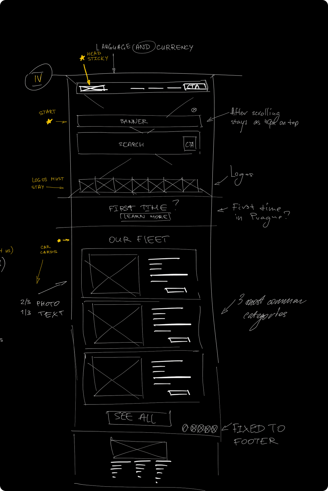
I started with lo-fi sketches for desktop and mobile, applying familiar reading patterns:
Z-pattern on the homepage to guide attention
F-pattern in the form layout for clarity
This helped define hierarchy before diving into visuals.


#structure —
S ohledem na omezený rozsah tohoto studentského projektu jsem začala s jednoduššími metodami, které přesto přinesly použitelné poznatky.


#system —
#form —
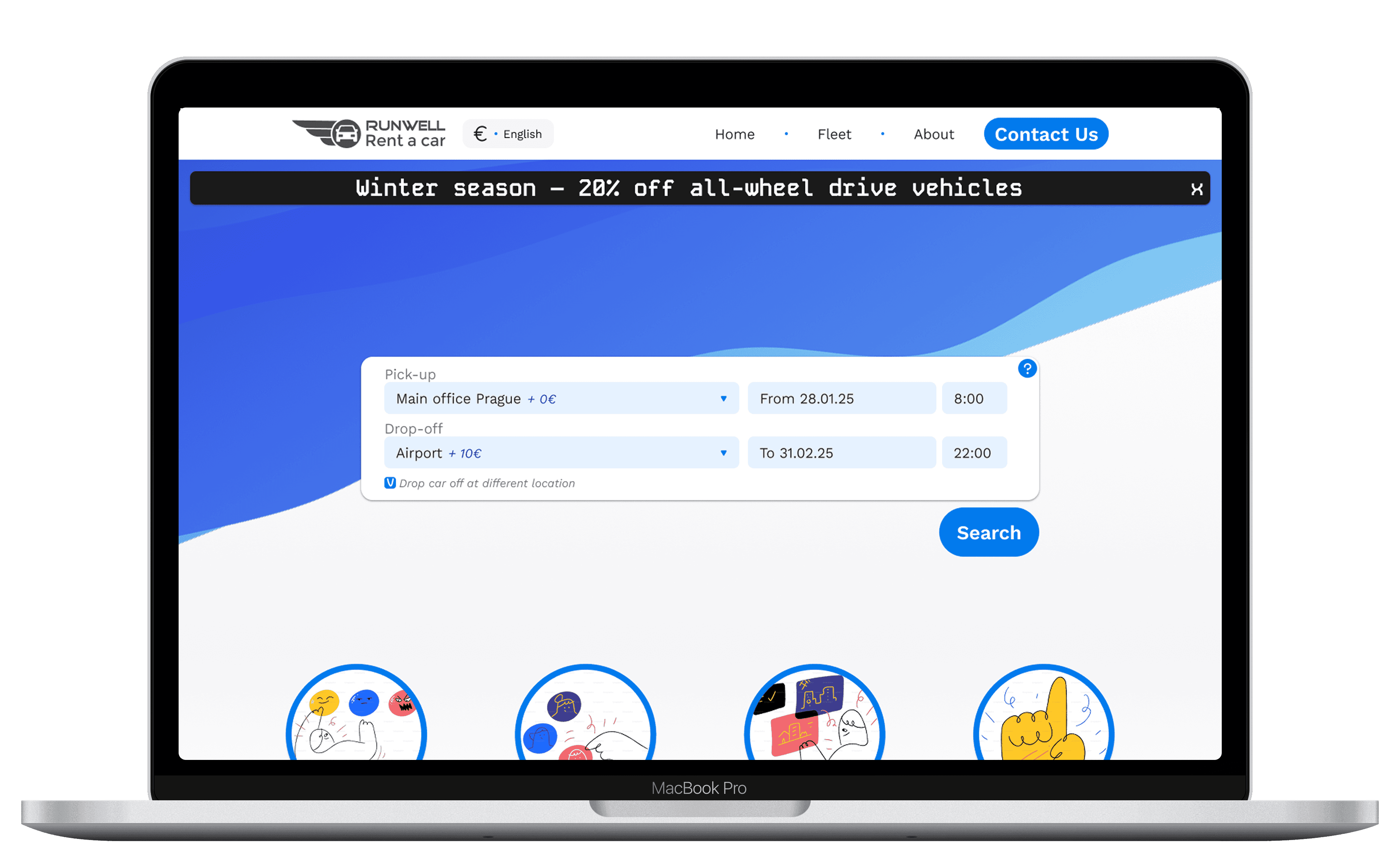
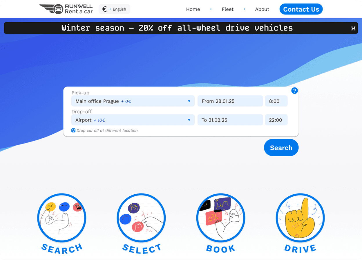
The form. From overwhelming to intuitive
The original form was dense and hard to scan. I grouped related fields, aligned inputs properly, and made CTA buttons visible at all times. A toggle for “drop-off at a different location” was added with clear visual logic. On mobile, it’s all thumb-friendly and gesture-supported.
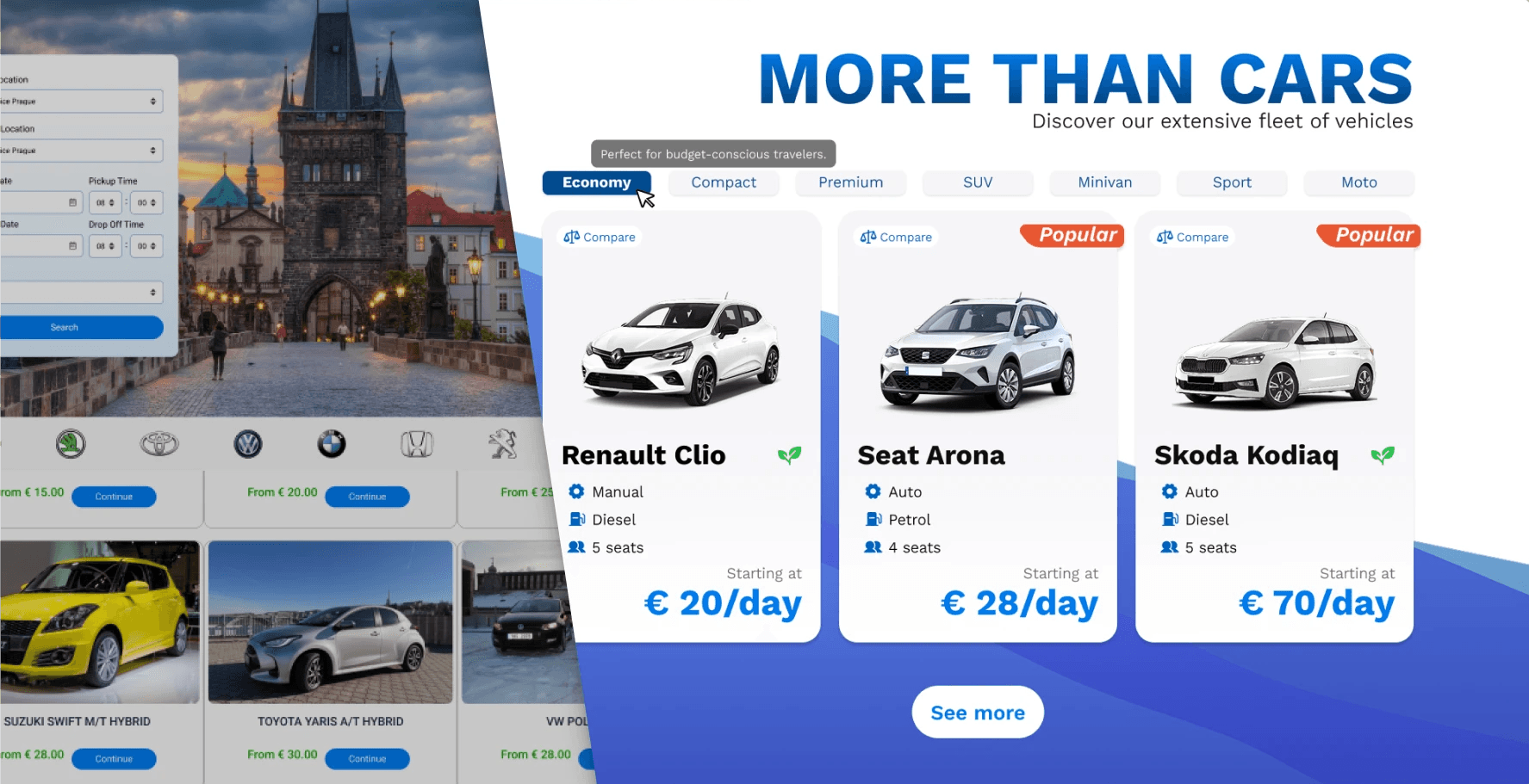
Each card shows just what’s needed — nothing more, nothing less:
vehicle type, fuel, transmission, seats, and price.
Popular cars are visually marked.
Actions appear on hover (desktop) or are visible from the start (mobile) to keep things clean but accessible.

Testování prvního prototypu

From homepage to cards to booking flow — each element was designed to adapt across breakpoints and support microinteractions.
The result: a consistent experience that feels natural both on desktop and mobile.

Reflexe
Reflexe
This project reminded me how much structure shapes perception.
I didn’t redesign the brand, rewrite the content, or add new features — but just by cleaning layout logic and rethinking how components behave, the product felt more confident. And more human.
Even without access to analytics or user interviews, small design decisions added up: clearer form logic, cleaner cards, responsive behaviors that don't distract. It became easier to trust the interface — not because of gradients or microcopy, but because everything was where it should be.
That said — I wouldn’t do it the same way again.
I’d test more assumptions: see how people move through the flow, how fast they book, where they hesitate. I’d validate if visual clarity actually helped reduce friction or just felt better to me as a designer.
Využívání omezení k řízení rozhodnutí — zejména při definování funkcí.
Upřednostňování přístupnosti před vizuální složitostí.
Aplikování logiky komponent již na začátku, inspirováno Fluent 2.
Příliš mnoho barev na počátečních obrazovkách — narazilo to na cíle srozumitelnosti a přístupnosti.
Přehlížení základní struktury — ztížilo to prototypování víc, než bylo nutné. 4o mini
#context —
#reflections —